
You’re ready to get your website live, and then a seemingly small choice starts affecting everything else. The font on your headings, service pages, and calls to action shapes how your business comes across before a visitor reads a full sentence.
For a UK small business, serif fonts are not just a style preference. They signal different commercial outcomes. One serif can make a firm look established and dependable. Another can add a premium feel for high-ticket services. A third can make longer pages easier to read, which helps visitors stay on the page long enough to enquire.
That is the key decision. You are not only choosing a font. You are choosing the impression that supports your sales process.
The best serif for a solicitor, consultant, accountant, coach, or boutique retailer will not be the same, because the goal is not the same. Some businesses need more trust at first glance. Some need a stronger luxury signal. Some need clear reading on content-heavy pages. Good typography works alongside your website layout and page structure to support those outcomes.
This guide examines eight serif fonts small businesses use to build credibility, polish, and readability online, with clear advice on where each fits and where it can backfire. If you want that decision handled properly from the start, a managed website service removes the guesswork by pairing the right font, layout, hosting, SSL, and maintenance in one setup, so your site looks professional and is ready to generate enquiries quickly.
All our work comes with a 30-day money-back guarantee. We also offer an interactive live chat system to design your website.
Table of Contents
1. Georgia
If you want a dependable serif font for a small business website, Georgia is usually where I’d start. It was built to work well on screens, and that shows in everyday use. The letters remain readable at smaller sizes, making it a practical pick for service pages, blog posts, and About pages that need to do real work.
Georgia suits businesses that need to sound clear rather than flashy. Think accountants, consultants, trades, clinics, local agencies, and firms with detailed service copy. It also fits content-heavy sites where customers need to read before they enquire.
Why Georgia works online
Many owners worry that serif fonts will feel old-fashioned. Georgia usually doesn’t. It feels established without looking stiff, and it handles body text well when you keep the sizing sensible.
Use it in body copy at around 14-16px, and give it breathing room with a line-height of about 1.5 or more. Pairing it with a straightforward sans serif such as Arial or Verdana in headings often gives the page enough contrast without looking over-designed. If you’re shaping content blocks and spacing at the same time, a clean website layout approach for small business pages makes that pairing much easier to get right.
Practical rule: If your website has lots of explanation, Georgia usually performs better in body text than more decorative serifs.
Real-world fit matters here. Georgia feels at home on news-style pages, institutional sites, and information-led business websites. If your prospect arrives with a problem and wants reassurance, this font helps the words do the talking.
A common mistake is using Georgia everywhere, including oversized headings and buttons. That can make a homepage feel heavy. Keep it mostly for reading text, then let a cleaner heading font carry the page structure.
- Best for: Service pages, articles, guides, and detailed homepage sections.
- Avoid if: Your brand depends on high-fashion styling or ultra-modern minimalism.
- Works well with: Neutral colours, generous spacing, and simple navigation.
2. Times New Roman
Times New Roman is the serif everyone recognises. That familiarity is both its strength and its weakness. If your business serves a traditional audience, it can signal formality and stability straight away. If your market expects a more current look, it can feel like you never moved past the default settings.
There is also a genuine UK digital history behind that formal tone. IBISWorld notes that the historical adoption of serif fonts in the UK digital sphere began with the 1999 launch of gov.uk using Times New Roman, and projects 2,206 UK web design businesses in 2026 within a Web Design Services industry that recorded £621.3m revenue in 2023, as outlined in the IBISWorld UK web design services industry report.
When it helps and when it hurts
Times New Roman works best when your business benefits from a conventional look. Law firms, compliance consultancies, training providers, and formal B2B services can still use it well in the right context. On a homepage for a youth brand, creative studio, or modern ecommerce shop, it’s usually the wrong call.
Keep screen sizes sensible. For web display, 12px is often too cramped unless the page is tightly controlled, so most businesses should lean towards 14px and test on mobile. Better still, use it in formal documents, downloadable proposals, or policy pages, while keeping your main site typography slightly more contemporary.
Times New Roman earns trust from familiarity, but familiarity can also look lazy if the rest of the brand feels generic.
The smartest compromise is often this. Use Times New Roman where formality matters, then support it with a cleaner, modern heading system and a solid page structure. If your site also needs to rank and convert, SEO-friendly web design for UK small businesses matters more than any single type face choice.
A practical example is a specialist legal adviser whose prospects want reassurance before they want personality. In that case, Times New Roman can work. A wedding florist or skincare brand trying the same font will usually come across as too plain.
3. Garamond
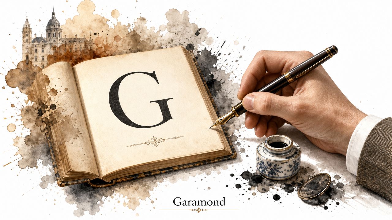
Garamond is what many owners mean when they say they want a font that feels elegant. It has a literary, heritage-heavy tone that can make a business look more refined. Used well, it suggests care, taste, and a premium position. Used badly, it can make the site feel delicate or overly formal.
That’s why Garamond usually works best in headlines, pull quotes, straplines, and brand accents rather than full pages of body copy. It shines when you want a customer to slow down and absorb the brand impression.
Best fit for premium brands
If you run a boutique consultancy, luxury service, heritage property business, jewellery studio, or high-end interiors brand, Garamond can earn its place. It helps your site feel curated. The right photography and white space matter just as much, because Garamond needs room to look intentional.
For web use, keep Garamond larger. Around 18px or above is usually safer for headings and highlighted text. For body copy, most businesses are better off switching to a more dependable serif or a clean sans serif.
A strong pairing is Garamond for hero headings with a restrained body font underneath. That mix often works well for startups looking to project a premium image without coming across as cold. If you’re building from scratch, website design support for startups can help you avoid the usual trap of choosing a classy typeface and then surrounding it with weak layout decisions.
- Good use case: “Private wealth planning”, “Bespoke interior design”, “Independent publisher”.
- Poor use case: Dense FAQ pages, long mobile-heavy service text, crowded landing pages.
- Best visual partners: Minimal palettes, editorial photography, generous margins.
One trade-off is worth flagging. An ornate or sharply luxurious serif can miss with younger audiences. A UK-focused marketing research study highlighted by Adobe’s serif vs sans serif guide found that 58% of Gen Z consumers associate sharp-contrast serifs with outdated branding. Garamond isn’t as aggressive as a Didone face, but the broader lesson still applies. Luxury cues need to match the audience, not just the owner’s taste.
4. Baskerville
Baskerville sits in a useful middle ground. It has more polish than Georgia and more authority than many contemporary web fonts, but it doesn’t feel as ceremonial as Times New Roman. For many professional service businesses, that balance is exactly right.
If your firm wants to appear credible, articulate, and premium without drifting into luxury-brand theatre, Baskerville is one of the safest serif fonts to consider. It has enough personality to feel chosen, not defaulted.
A strong choice for serious services
Baskerville works particularly well for law, accountancy, consulting, training, financial advice, and education-related brands. It gives long-form copy a composed tone, and it can make even straightforward service pages feel more considered. That matters when prospects are comparing near-identical offers and deciding who seems more competent.
Use it at 16px or above for body text on the web. It pairs well with modern sans serif fonts such as Helvetica or Open Sans for headings, navigation, and buttons. That contrast keeps the page practical while preserving the authority that Baskerville brings.
A serif like Baskerville won’t rescue vague copy. It will make strong copy feel more convincing.
There’s also a UK behavioural clue that supports this sort of choice. The IBISWorld material referenced earlier notes that by 2023, 72% of UK users spent 3+ minutes on serif-header sites versus 58% for sans-serif, and that 30% of UK agencies offer serif-first packages. Even if you don’t use Baskerville specifically, that points to a wider truth. Serious readers often respond well to serif-led presentation when the subject matter is substantial.
Baskerville does have limits. If your homepage relies on very small mobile text, compressed cards, or modern app-like UI patterns, it can feel slightly formal. It’s better on websites that let content breathe.
5. Merriweather
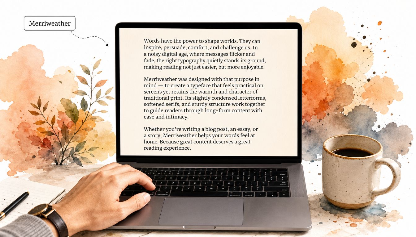
Merriweather is one of the easiest modern serifs to recommend because it behaves well on screens and doesn’t feel fussy. It has warmth without looking quaint. For UK small businesses that publish blogs, guides, local landing pages, or service explanations, that’s a practical combination.
This is the serif you choose when you want readability and a bit of character, but you don’t want the baggage of a more old-world face. It’s friendly enough for startups and solid enough for established SMEs.
A modern serif for useful content
Merriweather fits content-led business websites. Think solicitors publishing guides, accountants writing tax explainers, agencies running an insights section, or local service firms adding helpful articles to support search visibility. It also suits non-profits and community organisations that need to sound human rather than corporate.
Use it around 16-18px for body text. Pair it with Open Sans or Lato for headings if you want a cleaner top layer. Because it’s readily available online, it’s a practical option for businesses that want consistency across pages without licensing friction.
There’s an important mobile point here. UK small business owners often ask whether serif fonts hurt conversions on phones, but the available UK-specific material doesn’t establish a direct link. What it does show is that 72% of UK small business owners report mobile traffic exceeding desktop traffic, as noted on this Lapa collection page discussing serif font questions. So the safe takeaway isn’t “avoid serif on mobile”. It’s “test every font choice on mobile before launch”.
- Use when: Your site has blogs, articles, guides, or detailed service explanations.
- Think twice when: Your design relies on ultra-thin text or heavily stylised branding.
- Strong pairing: Merriweather body copy with a simple sans serif navigation and CTA set.
Merriweather often succeeds because it doesn’t try too hard. For many SMEs, that’s exactly what works.
6. Playfair Display
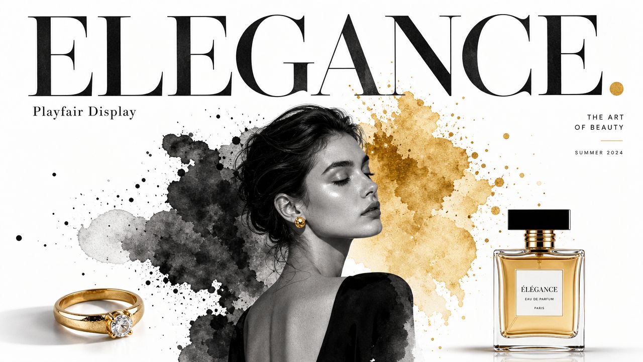
Playfair Display is not a general-purpose workhorse. It’s a statement font. If you use it for body copy, you’ll usually regret it. If you use it for a homepage heading, campaign banner, or premium product line, it can look outstanding.
This is an example of a serif that most owners are drawn to when they want elegance with an edge. It has that high-contrast, fashion-editorial feel that can instantly fit a brand, provided the rest of the site supports it.
Here’s the sort of visual tone Playfair Display creates:
Use it for impact, not paragraphs.
Playfair Display is best used for headings, hero sections, promotional graphics, and selected brand moments. Use it at a minimum of around 24px to 32px so the contrast and shape have space to read properly. Under that, it can start to look brittle on screens.
It works well for restaurants, salons, wedding businesses, premium beauty, boutique retail, and hospitality brands. It can also suit selected e-commerce businesses, especially where product photography carries most of the persuasion.
The risk is obvious. Overuse of it makes the site feel theatrical. That’s even more likely if your audience is younger and your messaging is meant to feel current. Luxury branding isn’t automatically trusted branding.
Use Playfair Display like jewellery. One strong piece works. Wearing all of it at once doesn’t.
A sensible setup is Playfair Display for the first visual hook, then a clean sans serif for body content, navigation, and forms. That keeps the site usable while preserving the premium cue at the top.
If you want to see the style in action before committing, this short video gives a feel for how display serifs behave in branding and layout choices:
For many SMEs, Playfair Display works best as an accent, not as the whole identity.
7. Lora
A small business site often needs to do two jobs at once. It has to look credible enough for a cautious buyer, but still feel human enough to start a conversation. Lora handles that balance well.
It gives you the authority of a serif without the colder, more formal feel some owners want to avoid. For service businesses that win work through trust, clarity, and a personal touch, that is a useful commercial position.
Balanced tone for approachable brands
Lora suits consultants, agencies, coaches, design-led firms, local service businesses, and ecommerce brands that want a warmer presentation. It works especially well when the goal is to look more considered than an off-the-shelf template, without drifting into something decorative or expensive-looking for its own sake.
It also gives you practical flexibility. Lora can carry headings, short introductions, and body copy on the same site without feeling disjointed, which matters if you want a simple font setup that is easy to maintain. For a small business owner using a managed website service, that usually means fewer design decisions, fewer inconsistencies, and a faster route to a polished result.
Use it at 14px-16px or larger for body text. Test slightly heavier weights for headings to keep the hierarchy clear. Pair it with Karla or Open Sans for a clean sans serif.
A good fit would be a boutique marketing consultant who wants to appear sharper than a generic competitor, while still sounding accessible on the page. Lora supports that kind of positioning. A sans-serif-first system will better serve a technical SaaS product with a dense dashboard and an interface-heavy UX.
- Best for: Personal brands, local firms, consultancies, creative services.
- Less ideal for: Hard-edged tech branding or highly formal institutional messaging.
- Commercial upside: Builds trust and polish without making the business feel distant.
8. Crimson Text
Crimson Text has a quieter presence than some of the other fonts on this list. It doesn’t grab attention the way Playfair does, and it doesn’t feel as common as Georgia. What it does offer is a bookish, thoughtful tone that works well when your business depends on depth, explanation, and careful wording.
That makes it a smart choice for advisory firms, legal content, academic organisations, specialist publishers, and consultancies selling expertise rather than impulse appeal.
A bookish serif that still works digitally
Crimson Text is strongest in body copy and longer reading sections. Use it at 16px or larger so the text stays comfortable on screen. Pair it with a straightforward sans serif like Source Sans Pro for headings and interface elements, and you’ll usually get a site that feels serious without being dense.
This font works when customers are prepared to read before making contact. Think immigration advisers, policy consultants, independent researchers, training providers, or firms with substantial thought leadership. It also suits names, acronyms, and formal labels when you use typographic features such as small caps with restraint.
There’s a useful reality check here. Some search results around this topic don’t provide expert-level UK-specific typography benchmarks, and some pages in the broader research set don’t mention serif fonts at all, as noted by this timeline-to-launching-a-business-or-product page and this website launch checklist page. So if someone promises exact UK conversion lifts from one serif over another, be sceptical. Most good font decisions still come down to fit, testing, and brand context.
Pick Crimson Text when your words carry the sale, not when your design needs to shout.
That restraint is its strength. If your business wants to sound informed, careful, and credible, Crimson Text can do that well.
Comparison of 8 Serif Fonts
| Font | Implementation complexity 🔄 | Resource requirements ⚡ | Expected outcomes 📊 | Ideal use cases 💡 | Key advantages ⭐ |
|---|---|---|---|---|---|
| Georgia | Very low, system-installed, simple fallbacks | Minimal, no webfont load | Clear, highly legible body text on small screens | Content-heavy & business sites; long-form reading | Exceptional screen clarity; universal availability |
| Times New Roman | Very low, ubiquitous system font | Minimal, preinstalled on major OSes | Formal, familiar appearance; reliable rendering | Formal documents, legal/academic sites | Trusted, highly compatible, time-tested |
| Garamond | Medium, may require webfont/licensing; careful sizing | Moderate, possible licensing or webfont file | Elegant, premium impression in large sizes | Luxury brands, editorial headings & branding | Sophisticated heritage look; excellent for display |
| Baskerville | Medium, webfont recommended for consistency | Moderate, use Libre Baskerville for web | Refined, balanced readability for headlines/body | Professional services, B2B, academic sites | Transitional elegance; versatile between headings/body |
| Merriweather | Medium, Google Fonts; multiple weights to manage | Moderate, webfont load (larger files) | Warm, modern readability optimised for screens | Blogs, publishing, modern business sites | Screen-optimised serif; free OFL; highly readable |
| Playfair Display | Medium, display font, needs large sizes | Moderate, webfont required; sizing impacts legibility | Dramatic, high-impact headlines; luxury tone | Headlines, premium e-commerce, editorial covers | High-contrast, memorable display presence |
| Lora | Low–medium, Google Fonts; versatile pairing | Moderate, webfont load but lightweight variants | Professional yet approachable across sizes | SMEs, creative agencies, content sites | Balanced serif with calligraphic warmth; versatile |
| Crimson Text | Medium, Google Fonts; best at adequate sizes | Moderate, webfont; enable typographic features | Exceptional long-form readability; scholarly tone | Academic, publishing, long-form editorial sites | Classical book typography; small caps and figures |
Get Your Professional Website Live in an Hour
Choosing the right serif font is a key step, but it’s just one piece of the puzzle. A font can shape trust, readability, and brand tone, yet it only works properly when the rest of the site supports it. Layout, spacing, copy, mobile usability, page speed, hosting, SSL, and ongoing maintenance all affect whether a visitor turns into an enquiry.
That’s where a managed service makes sense for busy UK small business owners. Instead of spending days comparing fonts, worrying about domain setup, or trying to work out why a page looks wrong on mobile, you can hand the process to people who build websites every day. The right team won’t just ask what looks nice. They’ll help you match your brand style to a commercial goal, whether that’s trust, clarity, authority, or a more premium position.
The 1stNet.AI website team specialises in taking these decisions off your plate. We transform your online presence with a stunning website, handling everything from font selection to final launch. That means you don’t need to coordinate separate providers for design, hosting, SSL, and maintenance, or guess whether your chosen typeface still works once real content goes in.
Launch your website fast with a domain, SSL, hosting & maintenance included. In an hour.
For owners who need to get online quickly, that kind of speed matters. It’s especially useful if your current site feels dated, your business has changed direction, or you’re still relying on social media and word of mouth without a proper web presence.
The process is also collaborative, not hands-off in the bad sense. There’s an INTERACTIVE LIVE CHAT SYSTEM TO DESIGN YOUR WEBSITE, so you can shape the look and feel in real time without getting dragged into technical jargon. If you know you want a website that feels more premium, more established, or easier to read, that conversation can turn vague preferences into practical design choices.
There’s also less risk than many owners expect. All our work comes with a 30-day money-back guarantee so that you can invest with confidence. That gives you room to move forward without the usual agency uncertainty.
If you’ve been stuck overthinking design choices, don’t stay stuck. A strong serif choice can help your site feel credible, but the bigger win is getting the whole website live properly and quickly. Don’t miss this chance to boost your brand. Call us now at 0204 577 2255.
If you want a professional website that looks credible, reads well, and goes live fast, 1stNet AI Ltd can handle the full job for you. From font choice and layout to domain, SSL, hosting, maintenance, and support, the team gives UK small businesses a done-for-you route to a better online presence without the usual delays.