

You’re probably in one of two situations right now. Your website is live, but the phone isn’t ringing, and the contact form sits quietly for days. Or you’ve delayed launching because every decision seems to trigger three more, from domain names and hosting to page speed, mobile design, and SEO.
That’s why SEO-friendly web design matters so much for a UK small business. It isn’t a layer you sprinkle on after launch. It’s the difference between a website that sits there looking respectable and one that helps people find you, trust you, and get in touch.
Time-poor owners are often trapped by fragmented decision-making. One provider handles branding. Another sells hosting. Someone else promises SEO later. The result is predictable: slow build times, muddled accountability, and a site that feels stitched together rather than built for results. Good web design doesn’t work like that. Structure, speed, content, security, and user experience all affect one another.
Many owners also worry that faster website delivery means generic work. That’s a false choice. Good process matters, but so does judgment, and human creativity still matters even with the rise of AI website building when the aim is to build a site that reflects your business and converts the right visitor.
Table of Contents
- Why Your Website Is a Sales Tool, Not a Brochure
- Planning Your Site Foundation and Navigation
- Designing for Speed and Mobile Users
- Creating Content with On-Page SEO in Mind
- Implementing Core Technical SEO Elements
- Prioritising Accessibility and User Experience
- Your SEO-Friendly Launch Checklist and Next Steps
Why Your Website Is a Sales Tool, Not a Brochure
A brochure website looks nice, says the right things, and still produces nothing. That happens when a business treats the site as a design purchase instead of a sales system.
The pattern is common. A local firm invests in a polished homepage, adds a few stock photos, writes a paragraph about “quality service”, and calls it done. Months later, analytics are flat, rankings are weak, and the only traffic comes from people who already know the company name. The website exists, but it doesn’t help the business grow.
A sales-focused website works differently. It answers the questions a buyer has before they call. It clearly shows the service, removes friction, builds trust, and gives Google clean signals about what each page is about. Every page has a job.
The expensive mistake of splitting everything up
Small businesses often buy the moving parts separately. One company sells the domain. Another manages hosting. A freelancer designs the pages. SEO is postponed until “phase two”. Maintenance gets ignored until something breaks.
That setup creates handoffs, delays, and gaps in responsibility.
Practical rule: If nobody owns the whole website experience from page structure to hosting performance, problems get passed around instead of fixed.
Buyers don’t experience your website in departments. They experience one thing. Either it loads, reads clearly, feels trustworthy, and guides them to act, or it doesn’t.
The same applies to search engines. Google doesn’t rank your design in isolation. It combines technical quality, page content, mobile usability, internal links, and performance. A weak decision in one area can drag down the rest.
Business outcomes come from connected decisions.
Think of your website like a shop on a high street. Design is the window display. SEO is the signage and location. Hosting is whether the front door opens properly. Security is whether customers trust the card machine. Content is what the staff say when someone walks in.
If one part fails, the sale becomes harder.
For a time-poor owner, that’s the core purpose of SEO-friendly web design. It shortens the gap between going live and getting useful traffic. It stops the common cycle of launching fast, then paying again to rebuild structure, speed, and content later.
A website should earn its keep. If it isn’t helping your visibility, enquiries, or bookings, it isn’t a business asset yet.
Planning Your Site Foundation and Navigation
The structure of your site determines how easily people and search engines can navigate it. Get that wrong, and even a strong design won’t rescue the results. Get it right, and everything else becomes easier, from content writing to internal linking.
Many rushed projects falter because owners start with colours, logos, and layouts before deciding what pages the site needs and how those pages connect.
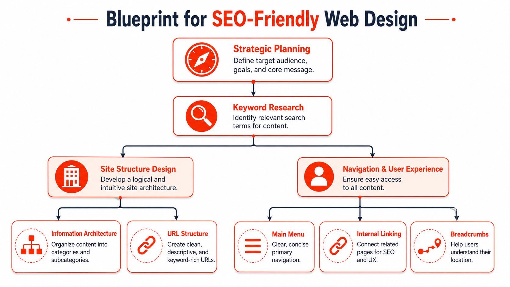
Start with the customer journey
Before you build a menu, map the path a customer takes from first visit to enquiry. Most small business sites only need a simple route:
- They land on a relevant page from search or referral.
- They confirm that you offer the right service in the right place.
- They look for proof and clarity, such as pricing approach, process, examples, or FAQs.
- They take action through a call, form, booking, or quote request.
That journey should shape your structure. If visitors have to dig through vague labels like “Solutions” or “Discover”, they’ll leave. Plain English beats clever wording.
A useful starting set of pages usually includes:
- Home for the overall value proposition and key routes into the site
- About trust, background, and positioning
- Service pages for each main offer
- Location pages if geography matters to the business
- Contact with a clear action
- FAQs or blog content to answer objections and support search visibility
If you’re still deciding how the web address fits into all this, this short guide on what a domain name is is worth reading before you finalise naming and page structure.
Keep the structure flat and predictable.
A site should not feel like a maze. A flat structure is easier to crawl, use, and maintain. As Jeremy Hickman notes on flat site structure for SEO, the recommended technical standard is to keep every page within a few clicks of the homepage so search engines can crawl the site efficiently.
That doesn’t mean every page belongs in the main menu. It means the hierarchy should stay shallow and logical.
Here’s a simple comparison:
| Approach | What it looks like | Likely result |
|---|---|---|
| Flat structure | Home > Services > Specific service | Faster discovery, clearer paths |
| Deep structure | Home > Solutions > Sectors > Categories > Service | More friction, weaker crawl paths |
Decide the main pages before design starts.
A good menu isn’t long. It’s clear. If you’re a plumber, accountant, solicitor, decorator, clinic, or consultant, your visitors usually want the same answers quickly: what you do, where you do it, why they should trust you, and how to contact you.
Use this planning test before any design work begins:
Can a new visitor identify your main service within seconds
If not, the structure is too vague.Can each core service have its own page
If everything is bundled into one page, search visibility becomes harder.Can someone reach an enquiry route from any important page
If not, leads leak out of the funnel.Can you add future pages without rebuilding the menu
If not, the architecture is brittle.
The homepage is not where you put everything. It’s where you direct people to the page that matches what they need.
Navigation is like the blueprint of a building. If the corridors make no sense, good interior decorating won’t fix it. In SEO-friendly web design, the menu, URL structure, and internal paths do quite a bit of work that pays off later.
Designing for Speed and Mobile Users
A common small business mistake goes like this. The new site looks polished during the design review on a laptop, but real customers open it on a phone over 4G, wait for a large banner to load, miss the call button, and give up before the enquiry form appears.
That is the trade-off in plain terms. If a site is slow or awkward on mobile, you do not just lose a few technical SEO points. You lose enquiries from people who were ready to act.
Mobile traffic now drives a large share of visits. Ink Digital’s review of how web design affects SEO outcomes notes that 58.67% of all traffic originates from mobile devices. For a UK small business, that changes the design brief. The phone experience needs to work first, not as a tidied-up version of the desktop layout.
A mobile-first build changes practical decisions early. The hero image has to earn its space. The main message needs to appear before the scroll. Buttons must be easy to tap. Forms need fewer fields. Long blocks of text often need to be broken up or cut back.
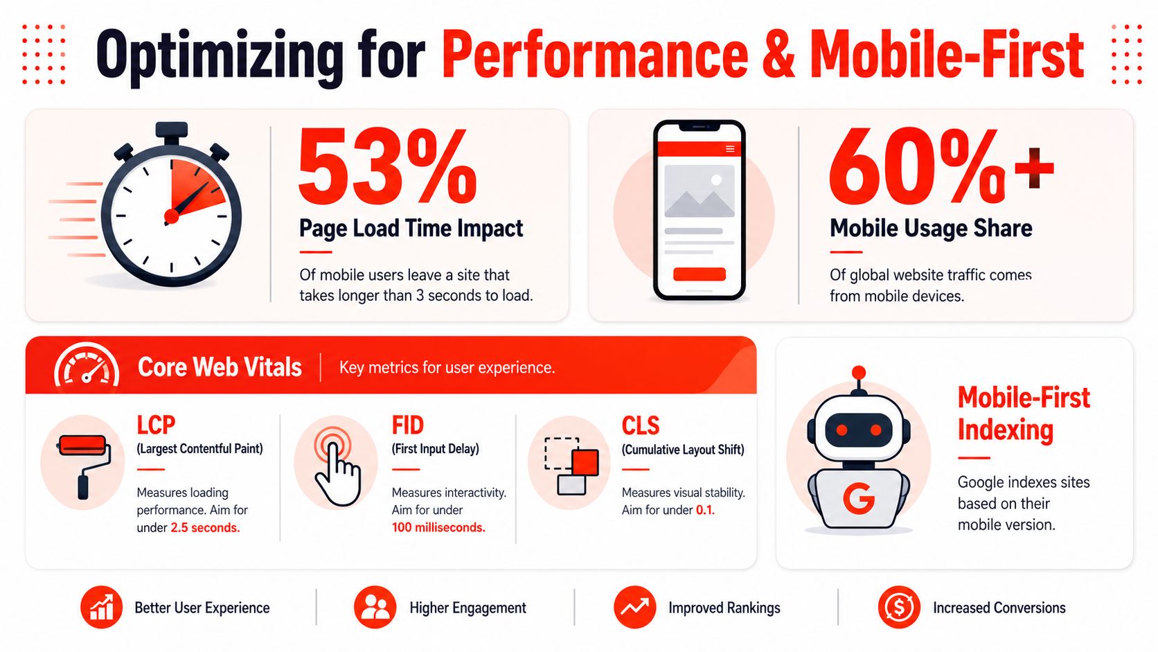
Mobile usability affects lead quality as much as traffic
I usually tell clients to test their own site one-handed while standing outside the office or sitting in a van between jobs. That is closer to real use than viewing a perfect mock-up on fibre broadband.
Check the basics:
- Can you understand what the business offers without zooming?
- Can you tap the main call to action with your thumb?
- Can you call, book, or enquire in under a minute?
- Does the page load the key content before large decorative elements?
- Does the form ask only for what the business needs?
These are business decisions disguised as design details. Every extra field, oversized image, or fancy animation adds friction. Sometimes the right choice isn’t the most impressive in a pitch meeting. It is the one that gets a visitor to contact you faster.
For owners weighing build quality and server performance, this guide to website design and hosting is useful because many speed problems start with the setup behind the site, not just the page layout.
What usually makes a small business site slow
Slow sites rarely fail because of one dramatic mistake. They get slower through small choices that seem harmless on their own.
- Large image files uploaded straight from a phone or camera
- Bulky themes packed with effects and features the business never uses
- Extra plugins and third-party scripts for chat widgets, popups, tracking tools, and animations
- Homepage sliders and motion effects that delay the content people came to read
- Cheap hosting that struggles even with modest traffic
The cost is straightforward. A slower site makes users wait, increases drop-off, and wastes the money spent getting people there in the first place. For a time-poor owner, that matters more than design trends. A website should shorten the path to a lead, not lengthen it.
A short technical explainer can help if you want to see how Google thinks about speed and mobile experience:
The performance choices worth making first
You do not need to chase perfection to get results. You need to remove the main blockers.
SuperHub’s guidance on UK website design best practices states that Largest Contentful Paint should occur within 2.5 seconds. It also recommends practical fixes, such as lazy-loading off-screen images and compressing assets into formats like WebP.
For many small businesses, the first wins are simple:
Compress and resize images before upload
A 3000px image rarely needs to be that large on a service page.Use a lightweight theme and fewer plugins
If a feature does not help generate leads, question whether it belongs on the site.Choose hosting that can cope with normal demand
Saving a small monthly fee on hosting often costs more in lost enquiries and avoidable rebuild work later.Keep mobile layouts simple.
Clear headings, short sections, obvious buttons, and fast-loading pages usually outperform clever effects.
A fast site creates confidence quickly. For a UK small business trying to win work against larger competitors, that speed is not a technical nice-to-have. It helps more visitors stay, understand the offer, and get in touch.
Creating Content with On-Page SEO in Mind
Once the structure and performance are sorted, the content has to do its job. Many sites underperform here because the copy sounds polished but says very little. Search engines struggle to understand it, and buyers don’t get enough clarity to act.
That’s why on-page SEO isn’t about stuffing keywords into paragraphs. It’s about making each page specific, useful, and easy to interpret.
The market itself reflects that shift. The UK Web Design Services industry is projected to include 2,206 businesses and reach £662.6 million in 2026, with a 3.5% CAGR between 2021 and 2026, reflecting demand for integrated digital services that include SEO alongside design, according to IBISWorld’s UK Web Design Services industry report.
Write pages for intent, not for vanity
A page should match what someone is searching for. If a business offers loft conversions in Leeds, the service page should clearly state that. If the page headline says “Transforming Spaces with Excellence”, it may sound nice, but it hides the service and weakens relevance.
A simple test helps. Ask: What would a real customer type into Google before landing here?
That intent should shape:
- the page title
- the H1 heading
- supporting H2s
- body copy
- internal links
- calls to action
Get the page basics right.
Each important page needs a few foundational elements working together.
| Element | What good looks like | What usually goes wrong |
|---|---|---|
| Title tagName | Is the service and location clearly | Vague branding only |
| Meta description | Explains the benefit and prompts a click | Generic sentence copied site-wide |
| H1 | One clear primary page heading | Multiple competing headings |
| H2s | Break down service details and FAQs | Used only for styling |
| URL | Short and descriptive | Long, cluttered, or meaningless |
| Internal links | Point to related services and contact routes | Random or missing links |
What works and what doesn’t
Good on-page SEO often looks less clever, not more.
Works well
- Specific service pages, such as “Emergency Electrician in Croydon”
- Clear headings that mirror customer questions
- Helpful FAQs that address cost, timelines, and process
- Natural keywords are used where they help in understanding
- Internal links that move visitors to related pages or enquiry actions
Usually fails
- One page for every service with barely any useful detail
- Keyword repetition that reads awkwardly
- Homepage-heavy sites where everything points back to the front page
- Thin content created only to target a phrase
- Company-first wording when the reader needs problem-first wording
Write the page your customer hoped to find, not the page your business wanted to publish.
For small businesses, the trade-off is time. Writing strong service pages takes effort, but weak copy creates hidden costs later through rewrites, poor rankings, and lower conversion rates. A shorter site with better pages usually performs better than a larger site filled with generic copy.
Implementing Core Technical SEO Elements
Technical SEO sounds intimidating, but for most small businesses, it comes down to trust, clarity, and control. Search engines need to access your pages, understand what they represent, and see that the site is stable and secure.
If content is what you say, technical SEO is whether your site proves it can be trusted.
Trust signals live under the surface.
A buyer may never mention your SSL certificate or canonical tags, but those details still affect how your site performs.
Here are the core elements that matter most:
HTTPS and SSL
Your site should load securely by default. That protects user data and supports trust.XML sitemap
This helps search engines discover your important pages.Robots controls
These tell crawlers what they should and shouldn’t access.Canonical tags
These reduce confusion about duplicate content by signalling the preferred version of a page.Schema markup
This adds structured context around your business details, services, and content.Redirect handling
If pages move, old URLs should point to the new location cleanly.Error management
Broken pages should be handled properly, not left to create dead ends.
The technical stack should reduce risk, not add to it
Technical SEO isn’t just about code tags. Hosting, updates, and maintenance shape the whole environment.
As Ryan Gittings notes in his UK SEO tips, website speed is a direct ranking factor in Google’s UK algorithm, and excessive file sizes or unoptimized scripts can lower visibility. That means technical quality isn’t a side issue. It sits inside your ranking potential.
All-in-one website management often makes sense for a small business. Instead of coordinating separate providers for hosting, SSL, maintenance, updates, and design changes, some owners choose a single managed setup. One example is 1stNet AI Ltd, which offers website design, domain registration, SSL certificates, hosting, maintenance, and support in a single process for small businesses.
That isn’t about convenience alone. It reduces handoffs when something breaks.
What to ask before you launch
Before any site goes live, ask these questions:
- Is the secure version of the site the default version
- Is there a clean sitemap, and are the right pages indexable
- Have old URLs been redirected if this is a rebuild
- Are duplicate page versions controlled
- Can someone update the site safely after launch without breaking key settings
Technical SEO works best when it’s boring. Stable, clean, predictable systems outperform complicated setups that nobody wants to maintain.
That’s the trade-off many small businesses miss. Fancy builds create visual excitement in the early stages, but simple, dependable systems usually produce better long-term search performance.
Prioritising Accessibility and User Experience
A common small business problem looks like this. The site gets found, a visitor lands on the page, then hesitates. The text is hard to scan, the button is vague, the form asks for too much, and the enquiry never happens.
That is not an SEO win. It is wasted traffic.
Accessibility and user experience affect what happens after the click; for a time-poor UK business owner, that matters because every design choice carries a trade-off. A flashy layout may look impressive in a meeting, but if it slows decisions down or confuses visitors, it costs leads. A simpler page often does more commercial work.
Good UX turns rankings into enquiries.
As noted earlier, a better user experience tends to lead to better conversion results. The practical reason is simple. People act when pages feel clear, trustworthy, and easy to use.
On a small business website, strong UX usually comes down to a few decisions that remove friction:
- Obvious next steps so visitors know whether to call, book, or request a quote
- Readable text with enough spacing and contrast to scan quickly
- Simple forms that ask only for information you will use
- Consistent layouts so each page feels familiar
- Clear calls to action that explain what happens after the click
None of that is decorative. It reduces hesitation.
I often see owners spend time polishing visual details while leaving the key decision points weak. From a lead-generation perspective, the reverse is usually smarter. A plain page with a clear offer and an easy enquiry route will outperform a prettier page that makes visitors work things out for themselves.
Accessibility improves usability, trust, and lead quality
Accessible design is often treated like a separate requirement. In practice, it improves the same things that help everyone else use the site properly.
That includes:
- Descriptive link text so people know where a click will take them
- Logical heading order so content has a clear structure
- Alt text for useful images where the image carries meaning
- Keyboard-friendly interaction for menus, buttons, and forms
- Colour contrast that supports reading without strain
These choices make pages easier to follow. They also reduce avoidable mistakes, which matters if someone is trying to contact you on a busy day, with a poor signal, or while multitasking.
Every obstacle creates drag. Small text, vague labels, cluttered sections, and crowded forms ask the visitor to do extra work. They rarely complain. They leave and try the next company.
If a visitor has to work hard to understand your page, they usually will not work harder to contact you.
There is also a practical cost on your side. Clearer pages lead to fewer dead-end visits, fewer abandoned forms, and fewer calls asking questions the website should have answered. For a small business with limited time, that is true value. Better accessibility and UX do not just help people use the site; they also help them find what they need. They help the site do more of the selling before you get involved.
Your SEO-Friendly Launch Checklist and Next Steps
A site can look ready and still fail at the jobs that matter. I see this often with small-business launches that are rushed to meet a deadline. The pages are live, but forms do not reach the right inbox, search engines cannot crawl a service page, or tracking was never installed. That is not a design problem. It is a business problem because missed leads are harder to spot than a broken layout.
The launch should be treated as a final pre-handover check. For a time-poor UK business owner, the aim is simple. Get the site live fast, without creating a trail of avoidable fixes that cost more time the following week.
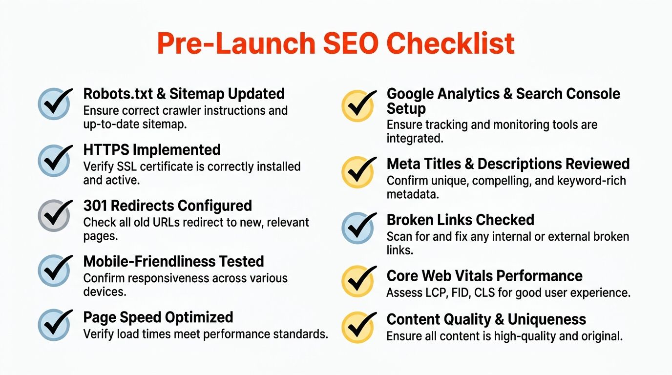
Check the essentials before going live.
Use this shortlist before launch:
Page speed has been tested
Check key pages on a real phone, not just a desktop preview. If the site feels slow, enquiry rates usually suffer before rankings do.Core pages are indexable.
Service, location, and contact pages need to be available to search engines. A noindex tag on the wrong page can inadvertently cut off future leads.Titles and descriptions are unique.e
Each main page should clearly describe its purpose. Reused metadata makes it harder for search engines and for searchers to decide whether to click.Internal links work properly.
Menus, buttons, and text links should take people to the next useful step. Dead ends waste the time, ads, or referrals you’ve already paid for.Forms have been tested.
Send a real test enquiry. Check confirmations, email routing, spam filtering, and what happens if someone makes a mistake on the form.Tracking is installed
Analytics and search monitoring should be in place from day one. Otherwise, you launch blind and lose the baseline data you need to judge what is working.Redirects are in place.
If this replaces an older site, map old URLs to the closest relevant new page. That protects any visibility and backlinks the old site had built up.Basic search appearance has been checked.
Review how the homepage and main service pages are likely to appear in search. Poor titles or awkward descriptions can depress clicks even when rankings are decent.
One practical trade-off matters here. You do not need to perfect every page before launch. You do need to protect the pages that drive enquiries, preserve old URLs if you have them, and ensure measurement is working. That is usually the best balance between speed-to-market and long-term SEO.
Launch is the start, not the finish.
A website starts producing useful data only after it is live. That is when you can see which pages attract impressions, where visitors drop off, and which enquiries turn into real work.
The smart next step is not a full rebuild every few months. It is a short, repeatable review process.
A sensible post-launch routine includes:
- Reviewing search queries so you can see how people describe the service they need
- Improving key pages where visibility is fine but clicks or enquiries are weak
- Adding content based on recurring customer questions from calls, emails, and sales conversations
- Monitoring performance and uptime so problems are fixed before they affect leads
- Updating software and security settings so the site stays stable and trusted
For many small businesses, this comes down to a straightforward decision. Handle design, hosting, SSL, maintenance, and launch checks separately, or use a single setup that consolidates those responsibilities and reduces admin work on your end.
1stNet AI Ltd provides website design with domain setup, SSL, hosting, and maintenance included. The team can be reached on 0204 577 2255. All work comes with a 30-day money-back guarantee, and an interactive live chat system is available during the design process.