
You’re probably in one of two situations right now. Either your business website feels dated, and you know it’s costing you enquiries, or you’re starting from scratch, and every design term sounds like it belongs in someone else’s job title.
That’s where web design layout matters, not as a design fad, and not as a pile of jargon. It’s the practical structure of your site. It decides what people see first, where they click next, and whether they trust you enough to call, book, or buy.
For a UK small business owner, that trade-off is rarely about art. It’s about results. A clean site that hides the phone number can lose leads. A busy site with everything shouting at once can do the same. The right layout sits in the middle. It looks modern, loads properly, and makes the next action obvious.
Table of Contents
- What Is Web Designing Layout and Why Does It Matter
- The Building Blocks of a Website Layout
- Common Web Layouts and When to Use Them
- Essential Considerations for Modern Layouts
- How to Choose the Right Layout for Your Business
- Bringing Your Ideal Layout to Life
- Frequently Asked Questions About Website Layouts
What Is Web Designing Layout and Why Does It Matter
Think of your website layout as the floor plan of your digital premises. If someone walks into a shop and can’t find the counter, the products, or the exit, they leave. Websites work the same way.
A good layout tells visitors where they are, what you do, and what they should do next. That might mean calling your office, filling in a quote form, booking a service, or buying a product. A weak layout forces people to work too hard. Most won’t bother.
In practice, layout is the arrangement of the parts that shape a page. The header, the menu, the hero section, the service blocks, the testimonials, the contact area, and the footer. None of those pieces matters much on its own. They matter because of how they work together.
Foursets’ web design statistics report that 94% of first impressions are driven by design, and 38% of web visitors leave because of poor design. For a small business, that’s not just a branding issue. It’s a sales issue.
Practical rule: If a visitor can’t tell what you offer and how to contact you within a few seconds, the layout is doing the business a disservice.
Why owners get stuck
Most owners don’t struggle because they lack taste. They struggle because they’re trying to balance three competing needs at once:
- Looking credible so the business feels established
- Staying simple so the site doesn’t become cluttered
- Driving action so the site produces actual leads
That’s why trendy design can go wrong. A stripped-back page may look polished, but if the quote button is buried or the service areas are unclear, it won’t pull its weight.
What a good layout really does
A strong layout builds trust before anyone even reads the first line. It shows structure, confidence, and clarity. It reduces friction. It also gives your content a job. Instead of dumping text onto a page, it guides people through a sequence that makes sense.
For most UK SMEs, the aim isn’t to impress another designer. It’s to make the next step obvious and easy.
The Building Blocks of a Website Layout
A webpage is easier to understand when you treat it like a set of rooms rather than a single big canvas. Each part has a role. Once you know those roles, conversations about layout stop feeling vague.
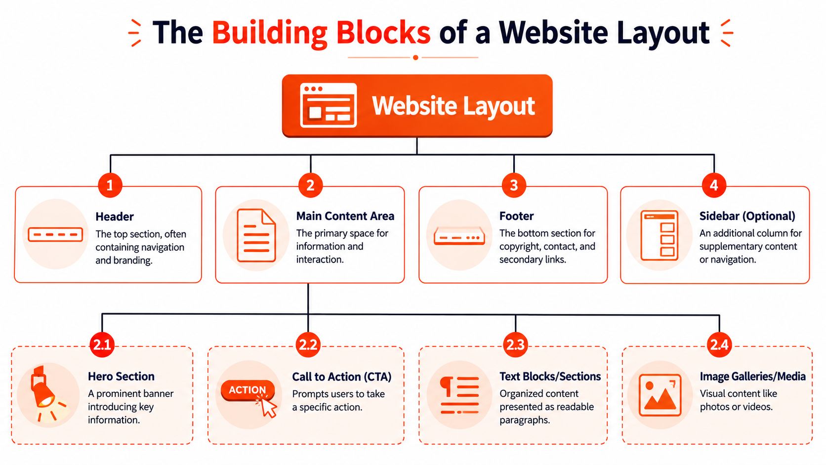
Header and navigation
The header is the entrance. It usually contains your logo, primary navigation, and often a clear call to action such as “Get a Quote” or “Book a Call”.
If the header is messy, people feel lost immediately. If it’s too minimal, they don’t know where to go. On a small business site, the usual mistake is cramming every page into the top menu. That creates hesitation.
A practical header usually needs:
- Brand recognition so people know whose site they’re on
- Simple navigation with a small number of high-priority options
- A visible action such as calling, booking, or requesting a quote
A visitor shouldn’t need to open three menus to find your phone number.
Main content and supporting areas
The main content area is where the page earns its keep. Here, you explain the offer, show proof, answer objections, and move the reader forward.
Inside that area, most business pages use a few common blocks:
- Hero section for the headline and core value
- Service or product sections to explain what you sell
- Trust elements such as reviews, certifications, or client logos
- Calls to action are placed where intent naturally rises
A sidebar can still be useful, but only in the right context. It suits blogs, resource hubs, and dashboard-style pages better than a simple service homepage. On many modern small-business sites, sidebars disappear on mobile anyway, so they shouldn’t contain anything critical.
The footer often gets ignored, which is a mistake. It’s where people expect to find contact details, service areas, legal pages, and secondary links. A thin footer with no substance can make a business look unfinished.
Here’s a simple breakdown:
| Page area | Main job | Common mistake |
|---|---|---|
| Header | Orientation and navigation | Too many menu items |
| Hero | State the offer fast | Generic slogan with no action |
| Main content | Explain and persuade | Dense text with weak hierarchy |
| Sidebar | Support browsing | Holding important content on mobile |
| Footer | Contact and reassurance | Missing business essentials |
When these blocks are organised properly, a website feels easier to use. That feeling matters more than flashy effects.
Common Web Layouts and When to Use Them
There isn’t one ideal layout for every business. A local trades company, a consultancy, an online shop, and a photographer need different structures because visitors arrive with different goals.
Four patterns that solve different problems
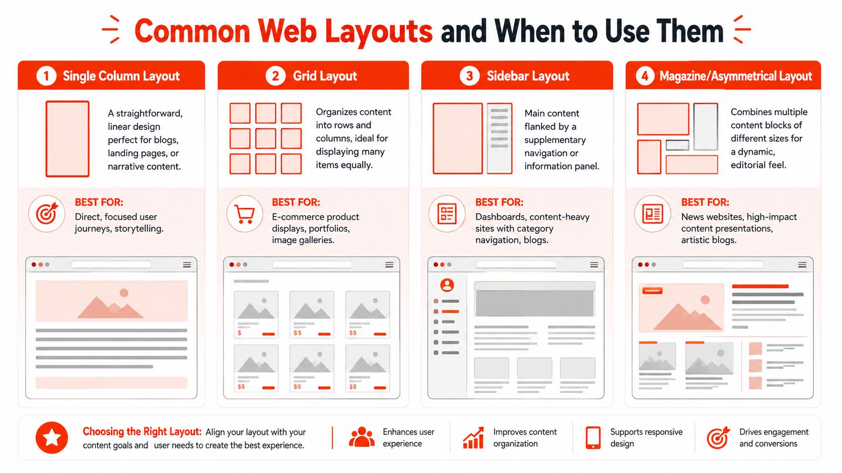
The single-column layout is straightforward and focused. It moves people down the page in a fixed order. That makes it strong for landing pages, local services, one-off campaigns, and businesses that need one clear action.
If you’re sending traffic to a campaign page, this is often the safest choice. It reduces distraction. It also works well for landing page design services that require a direct conversion path.
The grid layout is useful when you need to present many items with equal weight. Think product catalogues, portfolio items, property listings, or service categories. It lets people scan and compare.
The risk is that a grid can become mechanical. If every box looks identical and nothing is prioritised, visitors don’t know where to start.
The sidebar layout provides space for both the main content and the secondary navigation. It suits blogs, learning centres, documentation, and content-heavy websites where people may want to browse by topic.
For a basic brochure site, though, a sidebar often adds noise without helping decisions.
The magazine or asymmetrical layout creates visual energy. It can suit creative businesses, editorial brands, or premium positioning where presentation is part of the offer. Used well, it feels modern and distinctive.
Used badly, it becomes a puzzle. Small business owners often choose this style because it looks impressive in a mock-up. Then they discover it’s harder to maintain and easier to overload.
A quick comparison
| Layout type | Best for | Works well when | Usually fails when |
|---|---|---|---|
| Single column | Service businesses, campaigns | One main action matters most | You need lots of equal choices |
| Grid | Shops, portfolios, directories | Visitors want to compare options | No item is clearly prioritised |
| Sidebar | Blogs, resources, knowledge bases | Navigation depth matters | Mobile users need a simple route |
| Magazine or asymmetrical | Creative brands, editorial content | Visual storytelling supports the sale | Clarity gets sacrificed for style |
Matching layout to buyer intent
What works is usually the layout that matches the buyer’s decision pattern.
Someone looking for an emergency electrician wants speed, reassurance, and a clear point of contact. A tidy single-column or simple service layout fits. Someone browsing a furniture collection wants to compare styles and categories. A grid makes more sense.
Don’t choose a layout because it looks current. Choose it because it helps the visitor complete a task with less effort.
One more trade-off matters here. The more visually adventurous the layout, the harder it often becomes to keep messaging, mobile usability, and maintenance under control. That doesn’t mean creative layouts are wrong. It means they need discipline.
For most SMEs, clean beats clever.
Essential Considerations for Modern Layouts
A layout can look polished in a desktop mock-up and still fail in practice. Modern websites are judged by what happens on phones, on slower connections, and in quick moments when someone is half-distracted and ready to leave.
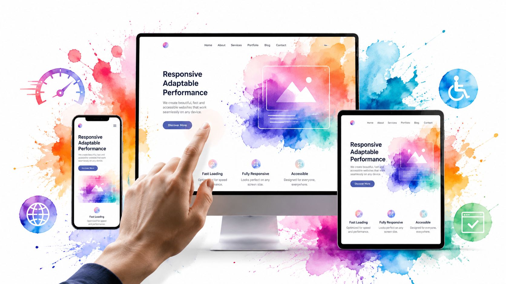
Performance is part of the layout.
Layout affects speed more than many owners realise. Heavy hero images, shifting page elements, oversized sections, and cluttered mobile stacks all slow things down or make pages feel unstable.
Get Extra’s UK performance analysis notes that UK businesses see a 1% increase in conversion rates for every 100ms improvement in page load speed. The same source reports an average LCP of 3.2 seconds against a 2.5-second target. That gap is enough to turn layout choices into a revenue issue.
A fast, well-structured page usually includes:
- Lean above-the-fold content so the first screen loads quickly
- Stable sections so buttons and text don’t jump around
- Clear hierarchy so mobile users don’t scroll through filler before the main point
If you’re reviewing a site build, look at the first screen on a phone before anything else. That tells you more than a desktop homepage ever will. It’s also where SEO-friendly web design becomes practical, not theoretical, because page structure and performance support both visibility and usability.
Accessibility and mobile use
Accessibility isn’t an optional polish layer. It’s part of competent layout work. Text needs room to breathe. Buttons need enough space to tap. Menus need to be usable without guesswork. Colour contrast and structure need to support people who don’t browse the way designers do.
This is also why “mobile-first” shouldn’t be treated like a slogan. It’s the discipline of designing for limited space first, where weak decisions are hardest to hide.
A short visual walkthrough helps make that point:
Layouts that work well on mobile tend to share a few habits:
- They prioritise one action per screen instead of competing prompts.
- They keep navigation short so people don’t get trapped in menus.
- They use spacing deliberately so tapping feels easy rather than fiddly.
If a layout only works when viewed full-width on a large monitor, it isn’t finished.
A modern layout has to deliver visual clarity, technical performance, and inclusive usability simultaneously. If one of those drops, the rest can’t fully compensate.
How to Choose the Right Layout for Your Business
A good layout helps the right visitor act without having to work out where to click, what matters, or whether your business looks credible.
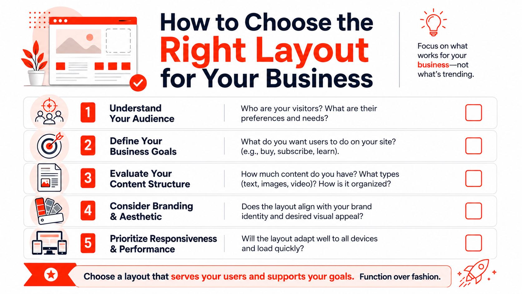
Start with the business goal.
Small business owners often see polished homepage concepts before anyone has settled on the page’s actual purpose. That usually leads to expensive revisions later.
Start with three questions:
- Who is the page for
- What do you want that person to do
- What do they need to see before they trust you enough to do it
Those answers narrow the layout faster than any design trend will. A startup chasing demo bookings needs a tighter journey than a local roofer trying to prompt calls. A site aimed at procurement teams needs more proof and structure than one aimed at homeowners comparing two or three providers.
Minimalism can work well, but only when it supports the sale. If the layout strips out contact details, service areas, pricing cues, reviews, or enquiry prompts, it stops being clean and starts hiding information people came for.
Those costs lead.
A practical shortlist
If you are choosing between two layout directions, assess them against the business, not the mock-up.
- Audience fit. A design-savvy audience may accept a bolder layout. A busy customer who wants a quote usually prefers speed and clarity.
- Content reality. If you need to show services, FAQs, testimonials, accreditations, and examples, an ultra-minimal layout can leave important questions unanswered.
- Sales path. Enquiry pages need the call to action placed early and repeated at sensible points. Portfolio-style browsing suits a different structure.
- Brand tone. A solicitor, fitness coach, and artisan maker can all look professional, but the page flow should match how each buyer judges trust.
- Maintenance load. Complex layouts often look better in a pitch than they do six months later when someone needs to update them quickly.
A simple scoring table helps keep the decision grounded:
| Question | If yes | If no |
|---|---|---|
| Do visitors need one clear action? | Use a focused layout. | Allow broader browsing |
| Do you have many equal items to show? | Consider a grid | Prioritise a guided flow |
| Is trust-building content essential? | Add proof sections early | Keep the page lighter |
| Will the content change often? | Use flexible modules | Custom structures may be fine |
For founders and early-stage firms, website design for startups usually works best when the layout keeps the story short, the offer clear, and the next step obvious.
The strongest layout is the one that fits your buying process, your content, and your budget to maintain it. If a prettier option makes updates harder or pushes key sales information down the page, it is probably the wrong choice for the business.
Bringing Your Ideal Layout to Life
A layout can look right in a planning document and still fall apart once it has to work on real phones, with real content, under real-time pressure. For a UK small business owner, that is usually the point where the project becomes expensive, delayed, or harder to manage than it needs to be.
The build stage is where trade-offs become practical. A lower-cost template can get you online quickly, but it may force awkward compromises in page structure, lead capture, or mobile presentation. A fully custom build gives more control, though it also comes with a higher cost, more decisions, and a greater risk of ending up with something difficult to update without outside help.
That middle ground matters. Pleebly’s UK web design cost guide notes that small-business website packages often increase in price as layout complexity and custom functionality increase. For many firms, the sensible option is the one that supports sales, loads properly, and can still be maintained without turning every small change into a separate job.
One practical route is 1stNet AI Ltd, which handles design, domain registration, SSL, hosting, maintenance, and support through one managed process. Bundling those parts together reduces handoffs that often slow launches and create confusion over who is responsible for what.
If speed and simplicity matter, 1stNet.AI offers website setup with domain, SSL, hosting, and maintenance included, along with a live chat system to help shape the design. You can call the team on 0204 577 2255. The 30-day money-back guarantee reduces the risk if you need to get a site live without committing to a long, fragmented process.
A good launch setup should do more than publish pages. It should give you a site that your business can use, update, and rely on.
Frequently Asked Questions About Website Layouts
How much does layout affect SEO
More than many owners expect. Search engines assess structure through headings, internal links, mobile usability, loading behaviour, and how clearly the page presents its main topic. Layout influences all of that.
It also affects what happens after the click. If visitors land on a page and cannot quickly find the answer, price range, or next step, they leave. Poor engagement does not help rankings, and it certainly does not help enquiries.
Can you change a layout later?
Yes, but late changes are rarely just cosmetic. Shifting the layout often means rewriting page sections, adjusting navigation, reworking mobile screens, and rethinking where calls to action sit.
For a small business, that usually means extra cost and lost time.
Change is still reasonable when the business has changed. A new service line, a different sales process, or a page that no longer brings leads are all good reasons to revise the structure.
Template or custom design
For many UK small businesses, a well-chosen template with thoughtful customisation is the practical option. It keeps costs under control and shortens the build time, provided the layout still supports your content and sales process.
Custom design tends to earn its keep when the site needs to handle unusual user journeys, layered service pages, or specific conversion steps that standard templates force into awkward workarounds.
A template with a clear strategy will usually perform better than a custom design built to look impressive but without a clear purpose.
How often should a layout be updated?
Update it when the current structure starts getting in the way. Common signs include rising mobile drop-off, weak enquiry rates, confusing navigation, or a homepage that no longer reflects what the business sells.
That does not always mean a full redesign. In many cases, tightening the hero section, simplifying the menu, or improving the contact path solves the actual problem for less money.
Does AI have a role in layout design?
Yes, mainly as a speed and testing tool. AI can help draft page structures, suggest content blocks, generate variations for different audiences, and reduce repetitive production work.
Used properly, it saves time. Used poorly, it produces generic layouts that look polished but miss the business’s commercial priorities. As noted earlier, UK SME reporting has pointed to stronger engagement and faster production when AI is applied carefully. However, owners still need human judgment on hierarchy, clarity, and what should happen next on the page.
What’s the most common layout mistake small businesses make
Trying to force every message onto the first screen.
Owners often want to mention every service, every credential, every offer, and every reassurance at once. The result is clutter, weak hierarchy, and a page that asks the visitor to do too much thinking. Good layout fixes that by putting information in the order a buyer needs it.
Should the homepage explain everything?
No. The homepage should guide, not overwhelm.
Its job is to confirm the visitor is in the right place, show what the business does, build enough trust to continue, and direct people to the next step. Detailed explanations can sit on service pages, pricing pages, FAQs, or case studies where they are easier to absorb.
If you want a website that’s structured to win trust and generate enquiries without getting dragged into a long agency timeline, 1stNet AI Ltd is built for that. The service includes domain, SSL, hosting, maintenance, and ongoing support, with an accelerated launch process for businesses that need to get online quickly.