
A visitor lands on your website after searching for a local service, scans the headline, checks the navigation, and leaves. The analytics show traffic, but the inbox stays quiet. You may have paid for search visibility, written useful content, and commissioned attractive photography, yet the website still behaves like a brochure rather than a sales system.
That problem rarely starts with the colour palette. Website design for lead generation is conversion engineering. It means deciding which page a visitor should see, what promise that page makes, how much information the visitor must provide, and how quickly they can call, message, book, or submit an enquiry. For UK small businesses, those structural decisions usually matter more than a cosmetic redesign.
Why Most Small Business Websites Fail at Lead Generation
A typical failure looks harmless. A building firm sends traffic to its homepage, where visitors can read about extensions, roofing, renovations, kitchens, and general building work. The page looks polished, but it asks every visitor to choose their own route through a broad menu. The call to action says “Get in touch”, the contact form requests a detailed project brief, and there’s no clear reason to enquire today.
The owner sees the traffic report and concludes that marketing isn’t working. In practice, the website may be creating the problem. A visitor with a leaking roof doesn’t want to interpret a company’s full service catalogue. They want confirmation that the business handles the job, serves their area, can be trusted, and offers an obvious next step.
Brochure design versus conversion design
A brochure website mainly answers, “Who are we?” A lead-generation website answers, “Can we solve this visitor’s problem, and what should they do next?”
That difference affects every page:
- The homepage establishes the main value proposition and directs different audiences to relevant services.
- A service page focuses on one problem, one audience, and one primary enquiry path.
- A landing page removes unnecessary choices and matches the visitor’s campaign or search intent.
- A contact flow asks only for information that helps the business respond properly.
- Supporting content handles objections and builds confidence without becoming a dead end.
A site can have excellent branding and still fail if the visitor can’t understand the offer quickly. It can also generate enquiries with a restrained visual style if the structure is clear, the copy is specific, and the contact path feels easy.
Practical rule: If a page doesn’t help a visitor understand, trust, or act, it needs a clear business reason to exist.
Use benchmarks as a starting point, not a promise
UK-focused conversion guidance commonly uses 3% to 5% form-fill conversion as a practical target for lead-generation websites, while top performers may reach 7% to 12%, according to UK website conversion guidance from Whitehat SEO. The basic calculation is straightforward: conversion rate equals conversions divided by visitors, multiplied by 100.
That benchmark needs context. The same source reports an average conversion rate of 12.3% for professional services and around 1.1% to 1.2% for B2B SaaS, where longer sales cycles and a more demanding conversion ask can make the enquiry harder. A small UK business attracting 10,000 monthly visitors would need roughly 300 to 500 conversions to sit within the 3% to 5% range, which shows why clarity, trust, and form design deserve attention before chasing more traffic.
The useful question isn’t, “Can we make the homepage look newer?” It’s, “What prevents the right visitor from taking the next step?” That shift turns the website from a digital business card into an active part of the sales process.
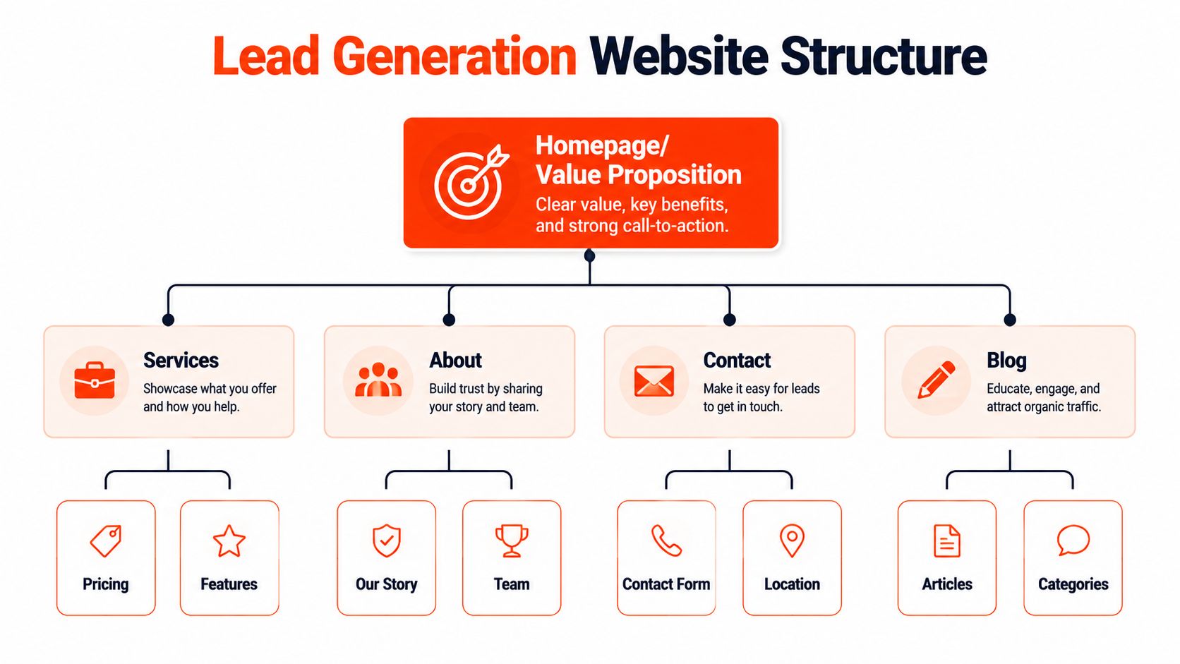
Planning Your Lead Generation Website Structure
Design work should begin with decisions, not templates. Before anyone chooses fonts or builds a hero section, define who the site serves, what that audience needs, and which action represents a meaningful enquiry.
Start with one primary audience per page. A solicitor serving landlords and families may need separate service pages because the risks, language, and evidence differ. A heating engineer may create distinct paths for boiler repairs, installations, and landlord servicing. Each page can still belong to the same brand, but it shouldn’t force unrelated visitors through the same message.
Build the architecture around intent
Write the core value proposition in a sentence that names the audience, service, location where relevant, and practical benefit. “Commercial electrical contractor for compliant workplace installations across Manchester” gives a visitor more direction than “Quality solutions for modern businesses.”
Then map the journey:
- Arrival: The visitor comes from search, LinkedIn, PPC, referral, or a local listing.
- Relevance: The first screen confirms that the page matches the visitor’s problem.
- Confidence: Evidence, process information, qualifications, reviews, and useful answers reduce perceived risk.
- Action: A call, form, booking, live chat, or lighter initial enquiry gives the visitor a clear route forward.
- Follow-up: The business receives enough context to respond appropriately.
Landing pages deserve their own treatment. UK-specific benchmark content reports a median landing-page conversion rate of 4.02% compared with 2.35% for average website pages, while Unbounce’s broader benchmark reports a 6.6% median across 41,000 pages, as summarised in UK landing-page design benchmark coverage. These figures aren’t a guarantee, but they support a sound design decision: campaign traffic should usually land on a focused page rather than a general homepage.
Choose pages that support the buying decision
A sensible hierarchy varies by business type:
| Business type | Core structure | Main conversion path |
|---|---|---|
| Trades | Home, services, individual service pages, areas served, reviews, contact | Call request, callback, or short enquiry |
| Professional services | Home, expertise, sector pages, team, insights, case evidence, contact | Consultation or suitability enquiry |
| Local retail | Home, product or category pages, location, delivery or collection information, contact | Visit, call, booking, or purchase |
Service pages should do more than list features. Explain the problem, show what the process involves, answer common objections, and finish with a relevant action. Case study pages should link back to the service they support. Blog posts should point readers towards a useful next step, such as a consultation, audit, quote, or related service.
Keep navigation broad on the main website, but narrow it on campaign landing pages. Removing unnecessary menu items can help a visitor stay focused, although it can also make it harder for cautious prospects to investigate the business. The right choice depends on traffic intent. Someone arriving from a tightly matched PPC advert may need one offer. Someone arriving through an informational search may need more supporting evidence before converting.
Designing CTAs and Forms That Actually Convert
A call to action should describe the next step in the visitor’s language. “Submit” describes a technical event. “Request a callback” describes an outcome. “Book a site assessment” tells the visitor what happens next and helps the business qualify the enquiry.
Match the CTA to intent. Cold traffic may respond to a low-commitment offer such as a callback, quick suitability check, or useful audit. A visitor who has already read a detailed service page may be ready for a quotation request. The mistake is presenting the most demanding form to everyone.
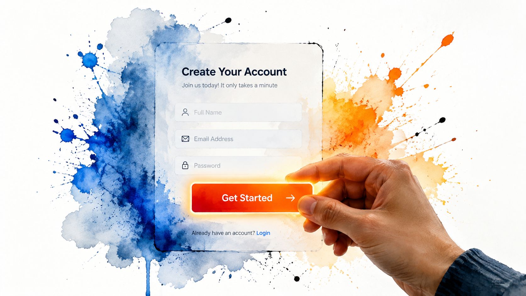
Wireframe the conversion moment first
Before writing the full page, sketch the point where the visitor acts. Put the primary CTA near the first value proposition, repeat it after the strongest evidence, and place the form where the visitor has enough context to understand why they’re completing it.
A useful form usually asks for the minimum information needed to respond well:
- Name and contact details: Make it possible to identify and reach the person.
- Service or project type: Route the enquiry to the right person.
- Location or timing: Useful for local services and availability checks.
- Message: Keep it optional or concise unless detail is necessary.
- Consent and privacy information: Explain how the business will use the submitted details.
A long quote form can produce richer leads, but it also creates more opportunities for abandonment. A short form increases accessibility for first contact, while the sales team may need to qualify the enquiry later. That’s a real trade-off, not a design flaw.
Multi-step forms can make a complex process feel lighter by asking easy questions first and delaying more sensitive or detailed questions. They can also frustrate visitors if the progress isn’t clear or the second step feels unexpectedly demanding. Use them when the information is necessary, not because the interface looks sleek or advanced.
The best form is not the shortest form. It’s the shortest form that lets your team take the right next action.
Trust signals belong close to the decision point. Place relevant reviews, recognised qualifications, guarantees, project photographs, client types, or clear service expectations beside the CTA rather than hiding them on an About page. A guarantee can reduce perceived risk, but it shouldn’t replace precise information about scope, timescales, or what happens after submission.
For a focused campaign page, consider dedicated landing-page design services when the homepage cannot provide the message match, layout control, or form experience the campaign needs.
A short demonstration can help a team understand how a form should guide the visitor. Keep video secondary, with a transcript or supporting copy available for people who prefer to scan.
Don’t let chat become decoration. A live chat prompt should answer a real question, route the conversation to someone capable of responding, and set honest expectations about availability. If the team can’t monitor it, a callback request or clearly displayed phone number may create a better experience.
Technical Performance and Mobile-First Conversion Design
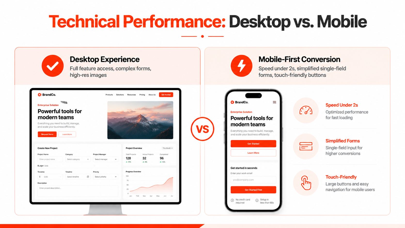
A desktop site can look polished yet lose enquiries on a phone. The number may be buried, the page may require horizontal scrolling, or the form may become awkward at the point of contact. Mobile-first design sets priorities around intent, screen space, touch input, and connection speed.
For local UK businesses, mobile visitors often want to call, visit, or ask a question quickly. UK-focused guidance cites 78% of local mobile searches ending in an offline visit and 88% resulting in a call or visit within a day, as discussed in UK mobile website conversion guidance. The design implication is straightforward: put the next useful action where a ready-to-buy visitor can reach it without searching.
Simplify the mobile path
A UK-focused benchmark cited in recent coverage reports desktop conversion at about 3.7% and mobile conversion at about 1.8%, across 6,000 sites and 90 billion sessions, as reported by Lightly Salted’s UK SME conversion guide. Treat the gap as a design warning, not a reason to copy a benchmark. Test the points where mobile visitors abandon the route:
- Can someone tap the phone number directly?
- Does the primary CTA stay visible when the decision is made?
- Are fields large enough for touch input?
- Does the keyboard cover the active field or submit button?
- Can a visitor describe the enquiry without writing a long paragraph?
- Do images, scripts, or tracking tools delay the first useful content?
A mobile-first wireframe should put the headline, relevant proof, action, and immediate reassurance into a compact sequence. Desktop layouts can support comparison tables, wider navigation, and additional detail. Mobile visitors should not have to work through every supporting element before they can contact the business.
Protect the foundations behind the page
Speed relies on hosting, caching, code quality, third-party scripts, content management updates, and monitoring, not image compression alone. SSL protects the connection and reassures visitors submitting personal information. Regular maintenance also reduces the risk that an outdated plugin, broken integration, or failed form removes the site’s main enquiry route.
Core Web Vitals offer a useful technical checklist, but a passing score does not make an unclear offer persuasive. A fast page still fails when visitors cannot tell what happens next. Strong copy cannot compensate for a slow page or a form that breaks on the device prospects use.
Review performance alongside SEO-friendly web design so search access and conversion usability support the same page structure. Choose managed hosting if nobody in the business owns updates, SSL checks, backups, and uptime. A bundled arrangement can reduce handoffs, but confirm what maintenance covers and who investigates failures. The goal is dependable intent capture, not a cosmetic redesign that merely performs well in a desktop demonstration.
Tracking Conversions and Running Iterative Improvements
A lead-generation website needs measurement in place before launch. Page views and search impressions show reach, but they do not confirm whether the site creates commercial opportunities. Define a conversion event for each meaningful contact route:
- A completed enquiry form
- A telephone-number click
- A live chat initiation
- A completed booking
- A resource download, when it represents a useful step
- An email click, when email is an intended contact channel
Record the page, device, campaign, and source where possible. Connect forms and bookings to the system the sales team uses, whether that is a CRM, shared pipeline, or managed inbox. A form submission that vanishes into an unmonitored email address is a tracking failure and a sales risk.
Interpret rates in context
A conversion rate is a diagnostic, not a universal score. Sector and visitor intent shape the result. An urgent local repair page may perform best with a direct phone CTA, while a complex consultancy service may need proof, explanation, and a lower-commitment first conversation.
Review results by page type rather than treating the domain as one unit. A homepage may serve several audiences and therefore produce mixed signals. A service page should have a tighter commercial purpose. A landing page linked to a specific advert should be assessed against that advert’s promise and the visitor intent it attracts.
Test the decisions most likely to matter
Small businesses rarely receive enough traffic to test every colour or animation. Start with decisions that affect clarity and effort:
- Headline: Compare a broad brand statement with a specific audience and outcome.
- CTA language: Test “Request a callback” against “Get a quote” when both accurately describe the next step.
- Form burden: Compare a short initial form with a longer qualification form.
- Proof placement: Move a relevant review or qualification closer to the form.
- Page focus: Remove unnecessary navigation or secondary offers from campaign traffic.
Change one major variable at a time where possible. Allow enough time to capture normal variation in traffic and enquiries, then assess submissions alongside lead quality and sales outcomes. A page that generates more unsuitable contacts can appear stronger in analytics while increasing follow-up work.
Measure acquisition channels consistently. LinkedIn, PPC, content-led inbound, and organic search can bring visitors with different expectations, so use campaign tags and ask new leads how they found the business. A clear website marketing strategy should connect those acquisition activities with page purpose, conversion events, and the sales process. Review the findings regularly, then improve the page decision most likely to remove friction rather than commissioning a cosmetic redesign.
Your Lead Generation Website Launch Checklist
A launch checklist should test the commercial journey, not just whether the pages look finished. Ask a colleague who wasn’t involved in the build to use the site on a phone and complete the actions you want real prospects to take.
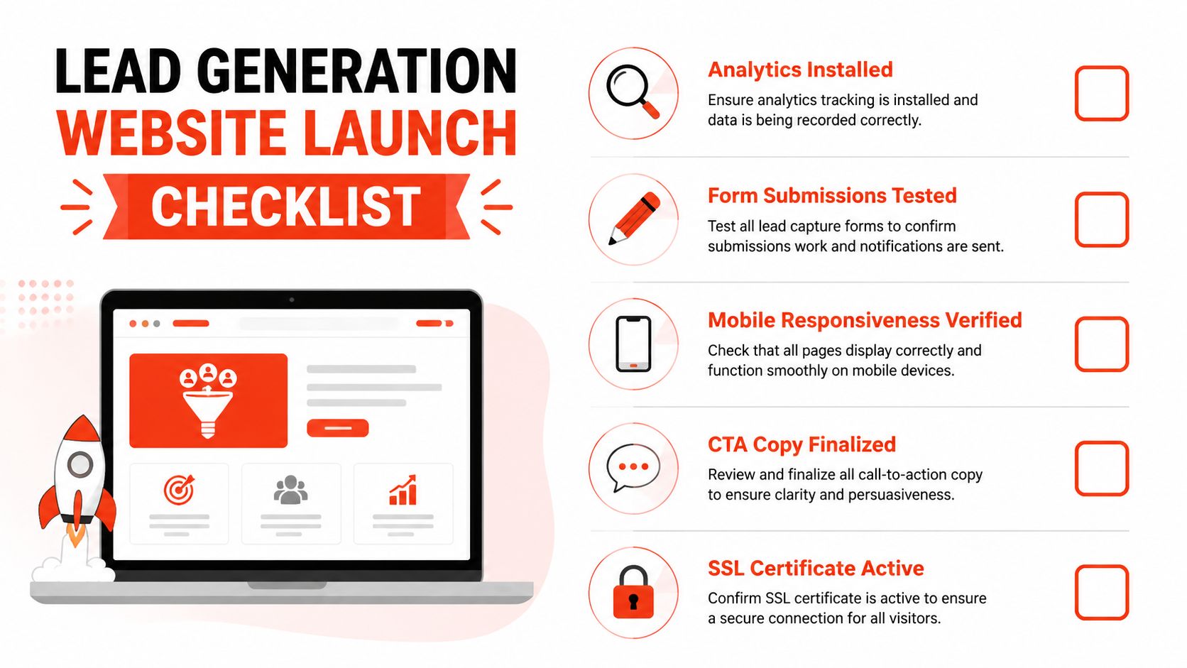
Before launch
- Check the message: Each important page names its audience, service, location where relevant, and next step.
- Test every form: Submit valid and invalid entries, confirm error messages, check notifications, and verify that the business receives the enquiry.
- Review mobile behaviour: Check menus, buttons, phone links, fields, image scaling, and sticky elements on common screen sizes.
- Inspect performance: Compress oversized media, remove unnecessary scripts, and check that the first useful content appears promptly.
- Follow every link: Confirm service links, email links, booking paths, privacy information, and thank-you pages.
- Verify trust content: Check reviews, qualifications, guarantees, business details, and contact information for accuracy.
On launch day
Install analytics and verify that form submissions, phone clicks, chat starts, and bookings register as intended. Confirm that the SSL certificate is active, submit the site to relevant search tools, and test the live version rather than relying only on a staging environment.
A managed provider can simplify the operational side by combining domain registration, SSL, hosting, design, and maintenance. That model reduces coordination between separate vendors, which can help a small business launch faster, but the agreement should clearly state ownership, support arrangements, update responsibilities, and cancellation terms.
1stNet AI Ltd offers website design and development with domain, SSL, managed hosting, maintenance, live chat support, and an accelerated launch option. Its published service model also includes a 30-day money-back guarantee, and the team can be contacted on 0204 577 2255 for project discussions.
After launch
Monitor enquiries and lead quality, not just visitor volume. Check that forms continue to work after updates, review mobile performance, investigate sudden drops in calls or submissions, and keep security and content maintenance scheduled.
The strongest launch is not a finish line. It’s the point at which the business can finally observe the journey, remove the largest obstacle, and improve the page with evidence rather than taste.
Launch your website fast with a domain, SSL, hosting and maintenance included, in an hour, through the 1stNet.AI website team. The service is designed to transform an online presence with a purpose-built website, interactive live chat system, and a 30-day money-back guarantee. Call 0204 577 2255 to discuss a lead-generation website that’s built to produce enquiries, not just impressions.
Visit 1stNet AI Ltd to arrange a managed website build covering design, development, domain, SSL, hosting, maintenance, and ongoing support. The team can help turn your website into a clearer conversion path, with an accelerated launch option for businesses that need to go live quickly.