

You’ve pasted a new WordPress theme into the header, opened the site on your phone, and the whole page looks like a tiny desktop layout. The logo is unreadable, the navigation runs off the screen, and visitors need to pinch and drag before they can find your phone number. In many cases, the culprit is a missing or malformed meta tag for viewport.
The fix is small, but the delivery responsibility is larger. The tag tells mobile browsers how to size the layout viewport, while your CSS determines whether the page reflows, remains readable, and works with zoom. For a UK small business, mobile rendering belongs alongside accessibility, security, testing, and maintenance, not in a last-minute snippet pasted into one page.
Why the Viewport Meta Tag Matters for Your UK Site
A customer checks your site on a phone and finds a desktop layout compressed into a narrow screen. Text becomes difficult to read, controls feel cramped, and horizontal scrolling hides the next step. A missing or malformed meta tag for viewport can cause that result.
The tag tells a mobile browser to use the device’s CSS width when calculating the page layout. That gives responsive CSS the correct starting point for percentage widths, media queries, flexible images, and relative spacing. It does not make the page responsive on its own. A fixed-width table, oversized image, or rigid navigation can still break the layout.
Practical rule: Treat the viewport tag as the first line of responsive delivery, not the complete responsive solution.
UK public-sector guidance connects this setting with accessibility expectations. The GOV.UK Service Manual accessibility guidance says services should respond to the user’s device, page orientation, and preferred font size. For a commercial site, that is a useful way to frame WCAG 2.2 AA work: mobile rendering, readable content, orientation, and user control belong in the same delivery and audit workflow.
Zoom rights are part of that trade-off. A tag that restricts scaling may make a design appear more controlled, but it can prevent visitors from enlarging content. The practical choice is to avoid unnecessary zoom restrictions, then test that the layout remains usable when text or the page is enlarged.
Cloudflare Radar data for the 28 days to 22 June 2026 recorded 43.1% of UK web requests from mobile devices. That level of mobile use makes a shared responsive page structure a sensible default for small businesses. A separate mobile website is rarely needed, provided the same templates behave properly across screen sizes.
Include the tag in your SEO-friendly web design workflow, then test the rendered page rather than inspecting source code alone. Check whether a customer can read the headline, open the menu, complete a form, and reach the contact action without dragging sideways or losing the ability to zoom.
The Correct Meta Tag for Viewport and What Each Part Does
A CMS can show the right theme setting while serving a different <head> on a landing page, checkout screen, or custom error page. Check the HTML received by the browser, and confirm that each document has one authoritative viewport declaration.
<meta name="viewport" content="width=device-width, initial-scale=1">
The tag has two settings that affect the initial layout and viewing scale:
| Part | What it means | Why it belongs there |
|---|---|---|
name="viewport" | Identifies the metadata as viewport configuration | Mobile browsers know which instruction to process |
width=device-width | Matches the layout viewport to the device’s CSS width | Responsive CSS evaluates the available width correctly |
initial-scale=1 | Opens the page at its intended initial scale | Text and controls start at a readable size |
Without width=device-width, a browser may assume a wide desktop-style layout and shrink the whole page to fit a phone. The result can look miniature even when the desktop design is well organised. The setting gives responsive CSS the width it expects, but it does not repair fixed-width components or poor breakpoint rules.
initial-scale=1 controls the starting view only. It does not permanently set the visitor’s zoom level. Leave out user-scalable, maximum-scale, and similar restrictions so visitors retain normal zoom control. That choice supports accessibility testing and avoids treating visual uniformity as more important than user control.
Put it in every served template
Place the declaration inside <head> for every HTML-rendering template. Check the homepage, landing pages, articles, product pages, search results, checkout, account areas, and custom error pages where those templates exist.
Attribute order does not change the meaning, but consistency makes reviews easier. More important, avoid duplicate declarations. Themes, plugins, page builders, translation tools, and optimisation layers can each add a viewport tag, leaving competing instructions in the delivered markup.
For a CMS, inspect the final response in browser developer tools or a rendered-page audit. Do not rely only on the theme settings screen. Compare representative templates, including pages built outside the shared layout, then remove extra declarations so one shared template supplies the tag. A passing homepage check is not evidence that every customer journey receives the same head markup.
Common Viewport Variations and When to Use Them
Most viewport mistakes come from copying an old snippet without understanding what it changes. The canonical version is intentionally boring. That’s a strength.
| Variation | What it does | Effect on mobile |
|---|---|---|
width=device-width | Uses the device’s CSS viewport width | Gives responsive CSS the correct layout width |
width=1024 | Forces a fixed layout width | Often produces tiny content or horizontal scrolling on smaller phones |
initial-scale=1 | Uses the intended initial scale | Opens the page at a predictable reading size |
initial-scale=0 | Requests an extreme zoom-out starting point | Can make content appear too small and should not be used as a default |
No initial-scale | Leaves the initial scale to browser behaviour | Results can vary between browsers and layouts |
width=device-width, initial-scale=1, device-pixel-ratio=... | Adds a separate density-related token | Not needed for modern responsive work and can add confusion |
A fixed value such as width=1024 is a legacy pattern. It tells the browser to lay out the page at a width that may not match the phone, so the device has to scale or expose more of the page than the screen can show. Users then scroll sideways, zoom manually, or abandon the page.
The viewport width and device pixel density are different concepts. CSS evaluates layout in CSS pixels, while the physical screen can contain a different number of hardware pixels. You don’t need to insert a density setting into a modern responsive viewport declaration because a device has a high-resolution display.
initial-scale=0 is not a useful shortcut for making a page “fit”. It asks for a zoomed-out starting view, which can make controls and text difficult to read. Omitting initial-scale leaves more of the decision to the browser, but there’s little reason to surrender that predictability when the standard value is clear.
Use the canonical snippet first. Change it only when you can explain the browser behaviour you’re trying to solve.
Themes and plugins may add variations automatically. Inspect the output, remove fixed-width declarations, and avoid stacking snippets from multiple tutorials. A viewport declaration should support the layout, not compensate for CSS that needs redesigning.
Accessibility, Zoom Rights, and WCAG 2.2 AA
Disabling zoom is one of the most damaging viewport shortcuts. Adding user-scalable=no, user-scalable=0, or maximum-scale=1 can prevent visitors from enlarging content on a phone. That affects people with low vision, older visitors, and anyone who relies on magnification to read or operate controls.
The recommended tag contains no zoom restriction:
<meta name="viewport" content="width=device-width, initial-scale=1">
That choice aligns with the accessibility principle that users should control how large content becomes. The Writtle Parish Council accessibility audit explains that visually impaired users must be able to pinch-zoom to at least 2× and warns that user-scalable=no can create WCAG failures. The Site Ally UK accessibility guidance also highlights the risk of maximum-scale=1.0 and notes that iOS behaviour has changed over time, which is another reason not to rely on blanket viewport hacks.
Zoom is not a substitute for good layout
Under WCAG 2.2 AA Success Criterion 1.4.4, text should resize up to 200% without loss of content or functionality. Criterion 1.4.10 supports reflow at 320 CSS pixels, with exceptions for content that requires two-dimensional presentation. The GOV.UK public-sector accessibility requirements connect these expectations with responsive design and warn that content wider than the screen can hide information.
| Setting | Effect | Recommendation |
|---|---|---|
width=device-width | Matches layout width to the device | Use |
initial-scale=1 | Sets the normal opening scale | Use |
user-scalable=no | Can block pinch-to-zoom | Avoid |
user-scalable=0 | Can restrict enlargement | Avoid |
maximum-scale=1 | Limits how far users can zoom | Avoid |
| No zoom restriction | Preserves browser enlargement controls | Prefer |
Test more than the tag. Use readable base text, responsive type, adequate contrast, reflowable content, visible focus, and controls that remain usable at high zoom. The viewport can’t repair very small text, clipped buttons, or a menu that disappears when someone increases the text size.
Pairing the Viewport Tag With Responsive CSS
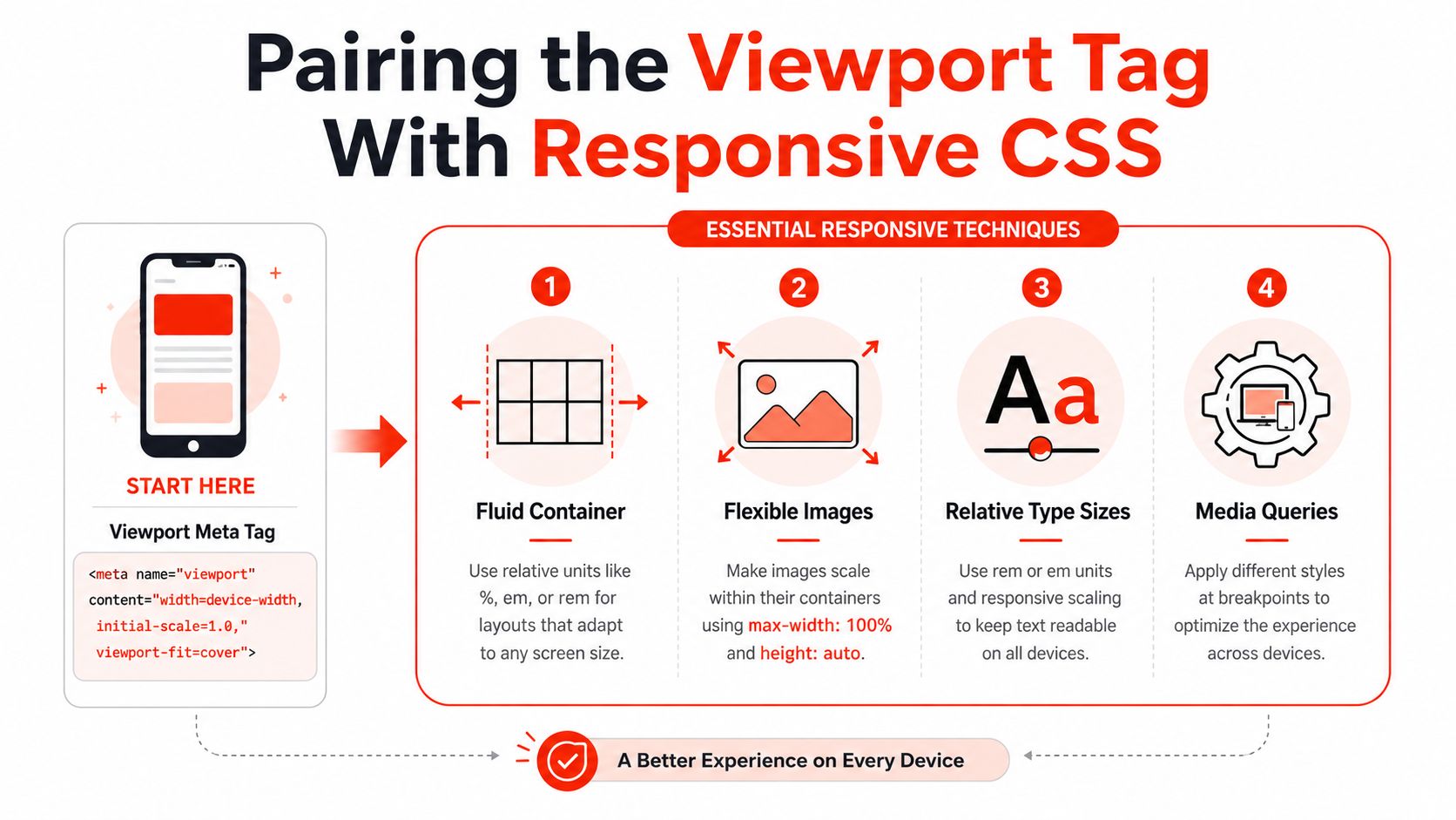
The viewport tag sets the browser’s layout width. Responsive CSS makes the design use that width well. Without fluid containers, flexible media, relative units, and content-led breakpoints, the tag merely gives broken CSS a more accurate view of the screen.
A practical starting point is a fluid container:
.container { width: 100%; max-width: 72rem; margin-inline: auto; }
Add internal spacing with a percentage or clamp() so narrow screens retain breathing room without wasting desktop space. Images should use max-width: 100% and height: auto. Cards should wrap, and navigation should switch to a usable mobile arrangement rather than forcing the visitor to scroll sideways.
Build around content, not phone models
Use rem or em for text and interface spacing where they make the layout scale naturally. Write media queries around points where the content becomes cramped, rather than targeting a named handset that may soon be replaced.
CSS pixels and physical device pixels aren’t interchangeable. The viewport tag helps the browser evaluate width=device-width, but pixel density doesn’t automatically alter the layout rules. Your CSS still needs to handle long headings, translated labels, large text settings, and unpredictable content.
Keep touch targets at least 24 by 24 CSS pixels under WCAG 2.2 AA, and check the surrounding spacing so adjacent controls remain distinguishable. Test keyboard order, visible focus, readable type, device orientation, and high zoom alongside visual breakpoints.
A responsive website layout service should therefore be judged by behaviour, not by whether the source contains the right line. The tag, CSS, content, and accessibility checks must work as one system.
Auditing the Viewport Tag Across Every Template
A correct homepage doesn’t prove that the site is correct. CMS platforms commonly use separate templates for campaigns, services, products, articles, account screens, checkout flows, and custom error responses. A page builder can also inject a second declaration after the main theme has already supplied one.
Start with the final HTML source for each route. Search the <head> for meta name="viewport", record its content value, and confirm that the document contains one authoritative element. Include server-rendered previews, cached pages, translated versions, and any route managed by a third-party plugin.
Test the rendered result
A lightweight crawl can create a useful inventory containing each URL, its declared viewport content, HTTP status, and final template. That inventory finds omissions, but it won’t reveal a fixed-width video, oversized map, clipped form, or chat widget. Render representative pages at 320 CSS pixels, then check text resizing to 200%, narrow and wide orientations, and desktop, tablet, and mobile user-agent views. These test points follow the accessibility expectations described in GOV.UK digital accessibility guidance.
| Audit area | Pass condition | Evidence to retain |
|---|---|---|
| Shared document head | One correct viewport declaration appears | Source capture and URL |
| Template coverage | Every HTML route receives the declaration | Crawl export and template name |
| Narrow layout | Content reflows without avoidable horizontal scrolling | Screenshot at 320 CSS pixels |
| Text enlargement | Content remains available and functional at 200% text zoom | Browser screenshot and notes |
| Embedded content | Maps, videos, forms, and chat remain usable | Page-specific test record |
| Regression control | Updates don’t remove or duplicate the declaration | Retest result and change reference |
Inspect third-party embeds separately because they often carry their own width assumptions. Record the browser, device or emulation profile, issue, owner, screenshot, and retest result. Repeat the audit after theme, plugin, and core-platform updates, not only before launch.
For a managed site, include this process in website management and maintenance rather than relying on someone to remember it after every release. A missing tag on one campaign template can undermine the mobile experience even when the main site passes.
Shipping a Compliant Site With 1stNet AI
A compliant launch treats the viewport declaration as one checked item in a wider delivery workflow. The template should include the correct tag by default, while responsive CSS, accessible forms, dependable hosting, SSL, and maintenance address the failures that appear after release.
Security belongs in the same handover. UK government guidance says web services should run only over HTTPS, with HTTP redirected automatically and HSTS enabled. Its HTTPS service guidance provides the HSTS example Strict-Transport-Security: max-age=31536000, includeSubDomains; preload;. The TLS guidance for external-facing services covers trustworthy certificate authorities, certificate revocation, and current TLS libraries and frameworks.

A single delivery process reduces handoffs. One team can check the viewport tag, responsive CSS, zoom access, performance basics, SSL, hosting, forms, and post-launch monitoring. The cost of a mobile defect is rarely the HTML edit itself. It is the missed enquiry, inaccessible form, broken campaign page, or delayed repair when several suppliers assume someone else owns the issue.
1stNet AI can include the viewport declaration, responsive CSS, SSL, and managed hosting in one launch workflow. Discuss the project with the team or start a conversation through live chat. All work is covered by a 30-day money-back guarantee.
Quick Reference Card for the Meta Tag for Viewport
Keep this beside your CMS or deployment checklist:
<meta name="viewport" content="width=device-width, initial-scale=1">
Place it inside the <head> of every HTML template, including landing pages and AMP templates where your implementation uses them. Confirm the final served HTML, not only the theme configuration.
| Snippet or rule | Use this | Avoid this |
|---|---|---|
| Layout width | width=device-width | Fixed values such as width=1024 |
| Opening scale | initial-scale=1 | initial-scale=0 or unexplained omissions |
| Zoom access | Leave zoom unrestricted | user-scalable=no, user-scalable=0, maximum-scale=1 |
| Responsive behaviour | Fluid CSS, flexible images, rem, em, percentages, and content-led media queries | Expecting the meta tag to fix rigid CSS |
| Template coverage | Add one declaration to every served HTML template | Adding it only to the homepage |
| Ongoing quality | Re-audit after theme, plugin, and platform updates | Assuming a previous pass remains valid |
Three operational rules prevent most failures:
- Use device width, not a fixed pixel width. Let CSS respond to the available layout space.
- Pair the tag with fluid design. Check containers, images, navigation, cards, forms, and embedded content.
- Protect zoom rights. Users must be able to enlarge content when they need to.
- Re-test after updates. A shared head element can change when a theme or plugin changes.
Avoid copying a fixed-width declaration from an old tutorial. Avoid stacking multiple viewport tags. Avoid treating a desktop preview in browser developer tools as proof that a real mobile layout works. Test narrow widths, text enlargement, orientation, keyboard access, and the actual customer journey.
If your site also takes online service bookings or payments, check the surrounding customer terms. UK consumers arranging services online, by phone, or by mail order generally have a 14-day cooling-off period, subject to the rules and exceptions explained in GOV.UK guidance on returns and refunds. A compliant mobile interface needs to support clear information and usable cancellation or contact journeys, not merely pass a source-code check.
1stNet AI Ltd can build and maintain a fast UK website with the viewport tag, responsive CSS, SSL, hosting, and ongoing checks handled in one workflow. Visit 1stNet AI Ltd to discuss your launch, use the interactive live chat system, and arrange a site backed by a 30-day money-back guarantee.