

You can have a website that looks polished and still loses enquiries. A visitor lands on the page, glances at the text on a phone, and leaves before they’ve understood what you sell, not because your offer is weak, but because the words are hard to decode at a glance. That’s where legibility matters, it’s the part of typography that decides whether people can read what’s on the screen.
If you’ve ever checked your analytics and felt puzzled by good traffic with weak enquiries, this is often the hidden issue. Customers don’t sit there patiently decoding tiny fonts, pale grey copy, or decorative lettering when they’re busy, distracted, or outdoors in daylight. They move on, and the business loses the chance to build trust or make the sale.
Table of Contents
Why Your Website Visitors Leave Without Converting
A lot of small business owners look at low conversions and assume the problem lives in ads, pricing, or the offer itself. Sometimes it does, but very often the first breakdown happens earlier, when the visitor tries to read the page and has to work too hard for every line. That friction is invisible to you, but it’s obvious to the person arriving on a phone in a hurry.
Think about a builder, a solicitor, or a local clinic owner. Their homepage might have the right message, but if the headline is in a thin script font and the body copy sits in low-contrast text, the user has to squint, zoom, or scroll away to another tab. That’s a conversion leak, because the reader hasn’t even reached the point where they can evaluate the offer properly.
Practical rule: if people need effort before they get clarity, you’ve already started losing them.
Legibility is the foundation under the rest of the user experience. Before a customer can trust your pricing, understand your service, or click a call-to-action, they need to physically read the page without strain. That’s why a well-designed site can still underperform if the typography fights the user instead of helping them.
A useful reminder is how quickly people decide whether a page feels usable. The earlier section about customers deciding in seconds on 1stNet AI’s customer behaviour page fits this reality, because the first impression is often visual and typographic before it’s persuasive.
Legibility vs Readability: Understanding the Difference
These two words get mixed up all the time, and that’s where a lot of bad fixes start. Legibility is about whether the eye can distinguish letters and words clearly. Readability is about whether the sentences and paragraphs are easy to understand once they’ve been read.
A page can be beautifully written and still fail because the font is too small, too light, or too ornate. A page can also be perfectly legible and still feel exhausting if the copy is cluttered with jargon, long sentences, or awkward structure. One problem sits at the level of seeing, the other sits at the level of comprehension.
Here’s the cleanest way to think about it, legibility is the gateway, readability is the journey. If the gateway is broken, the journey never starts. If the journey is confusing, the user may get through the gate but still leave before taking action.
| Aspect | Legibility | Readability |
|---|---|---|
| Scope | Recognising letters and words | Understanding sentences and paragraphs |
| Main influences | Font choice, size, contrast, spacing | Plain language, structure, sentence length |
| Typical fix | Increase size, improve contrast, simplify typeface | Rewrite copy, shorten blocks, improve flow |
| User question | Can I read this easily? | Do I understand what this means? |
A product page with strong writing in a light grey script font is a classic example of high readability trapped inside poor legibility. The customer may never reach the good writing because the text itself is too hard to decode. On the other hand, a block of dense legal language in a crisp sans-serif font can be legible and still fail commercially because people don’t want to wrestle with it.
The distinction matters because it stops you from solving the wrong problem. If the issue is legibility, changing the wording won’t fix it. If the issue is readability, changing the font won’t help much either.
The Factors That Make Text Easy or Hard to Read
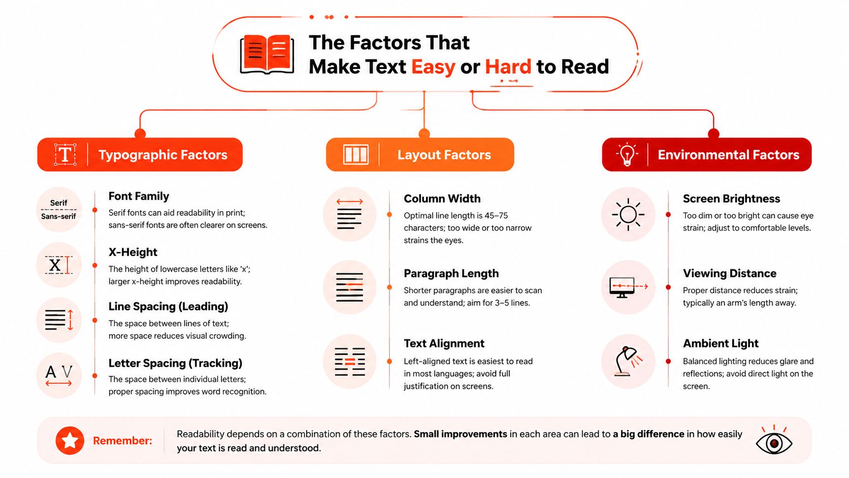
A good typeface can still fail on the wrong page. A font that looks polished in a design file may become hard to read on a small phone, in bright daylight, or when a visitor is in a hurry. For UK small businesses, that can mean weaker mobile conversions, more dropped sessions, and a first impression that feels less trustworthy.
GOV.UK treats typography as something measurable, not decorative. Its type scale guidance was tested and refined for readability across devices, with line height based on a 5px rhythm for easier scanning. It also recommends 18px body text for desktop, 16px for mobile, 14pt for print, line height of at least 120% and up to 160%, plus a line length of 45 to 75 characters, with a maximum of 90 characters at 100% zoom. (GOV.UK type scale guidance)
Start with your own eyes
Try the squint test first. If the text hierarchy collapses when you step back from the screen or narrow your focus, the page is leaning too heavily on fine detail instead of clear structure. Then check the same page on a real phone, not just a desktop browser window resized to pretend to be mobile.
Use a contrast checker to confirm whether text meets WCAG AA contrast expectations. A browser extension that simulates visual impairments can also reveal whether headings, buttons, and body text still hold together when vision isn’t perfect. The point isn’t to obsess over tools, it’s to catch the places where a customer would struggle before they tell you with a click away.
Use a quick five second test
Ask a colleague, customer, or friend to open the page and look at it for five seconds. Then ask them three simple questions, what is this business, what action is available, and what stands out first. If they can’t answer cleanly, the page isn’t communicating fast enough.
The same logic applies to scrolling. If the page jumps around visually, uses inconsistent spacing, or presents sections that feel disconnected, the reading experience becomes tiring. You can find those problems quickly by watching how the eye moves from one block to another.
Simple benchmark: if someone has to re-read the first screen just to understand the page, the typography is getting in the way.
The public-sector accessibility expectations around reflow, contrast, and enlarged text exist for a reason, they’re practical tests of whether content still works when conditions change. The website marketing strategy guide is a useful place to tie those checks back to the business goal, because legibility only matters if people can then act.
Practical Improvements You Can Make Today
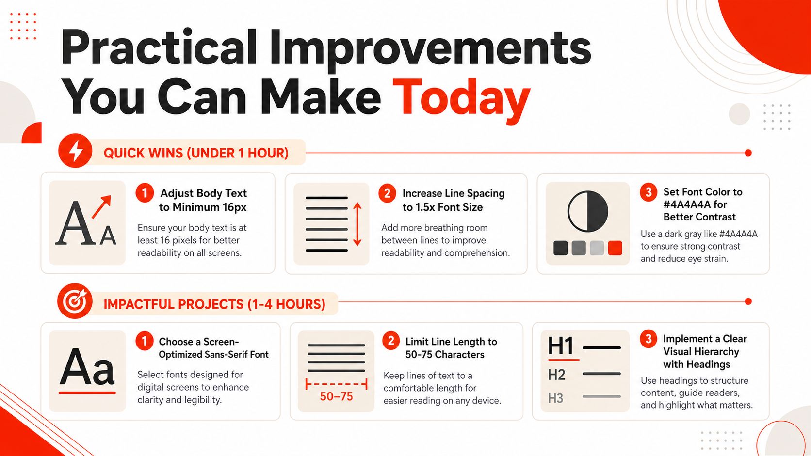
A small change to type can change how a customer feels about your site in seconds. For a UK small business, that can mean the difference between a quick enquiry and a frustrated exit. Start with the fixes that improve the first screen, then work toward the details that keep the page steady on different devices.
Quick wins
Make body text easier to read on a phone first, because that is where many visitors decide whether to stay. As noted earlier, UK government guidance on type scale recommends 16px for mobile and 18px for desktop, while public communication standards also point to 12-point as a general minimum and 14-point for sight-impaired audiences.
Give the text room to breathe. The guidance above points to line height between 120% and 160% for body content, which helps the eye move from line to line without losing its place. Keep text left-aligned, avoid italics in longer passages, and steer away from thin font weights if they are carrying important body copy.
A simple CSS starting point looks like this:
body { font-size: 16px; line-height: 1.5; }
p { max-width: 65ch; }
a, button { text-decoration-thickness: 0.12em; }
Those changes often do more than a visual refresh because they lower the effort needed at the point where someone is deciding whether to contact you. If your site uses pale text on a white background, fix the contrast first. A strong font cannot rescue weak colour choices.
Higher-impact refinements
Choose a screen-friendly sans-serif family with clear letter shapes for body copy and calls to action. Keep line length in the middle range so paragraphs do not sprawl across the screen or feel too narrow. Watch uppercase text carefully too, because spacing can make it easier to scan than tightly packed caps, but only when it is used sparingly.
Spacing and rhythm matter just as much as the font itself, as covered in the factors section. The type choices may look minor, yet they affect whether the page feels calm, credible, and easy to use. That matters for a service business where the homepage, pricing page, and enquiry form all need to guide people without hesitation.
If you use WordPress, typography plugins can help you control size and spacing without opening theme files. For custom builds, responsive typography lets text adapt to screen size without becoming tiny on mobile or awkwardly large on desktop.
Keep the brand voice, but do not let style block the sale. A polished heading still fails if the customer cannot read the call to action beneath it.
Connecting Legibility to Business Results
A visitor may not know the phrase “legibility,” but they feel it right away. Hard-to-read text makes people pause, squint, and leave sooner, especially on mobile where every extra second of effort can mean a lost enquiry. Clear text does the opposite. It makes the page feel easier to use, so customers get to the point faster.
That matters because typography affects more than appearance. It shapes how people judge your credibility, how smoothly assistive technology can handle the page, and how well the layout meets the accessibility expectations mentioned earlier. The UK public-sector standards exist for a reason. They push teams to choose contrast, spacing, reflow, and text sizes that reduce strain for disabled and non-disabled users alike.
A practical way to look at it is simple. If people can read your headline, body copy, and call to action without effort, they are more likely to reach the enquiry form, tap the call button, or finish checkout. That does not guarantee a sale. It does remove a barrier that costs small businesses leads every day.
| Metric | Before | After | Improvement |
|---|---|---|---|
| Visitor confidence | Unclear first impression | Clear, easy-to-scan page | Stronger trust |
| Mobile engagement | Frequent drop-off | Longer attention on page | Better stay rates |
| Enquiry behaviour | Fewer completed actions | More users reach CTA | Better conversion flow |
| Accessibility risk | Higher chance of failure | More compliant presentation | Lower compliance risk |
For a UK small business, that is the core value of legibility. It helps the site feel trustworthy, supports accessibility, and gives customers fewer reasons to hesitate. When the text reads well, the brand feels more careful and the page works harder for the business.