

You’re probably looking at a dashboard that says traffic is “up”, yet the phone still isn’t ringing, the inbox is quiet, and nobody can explain what changed. That’s the usual moment website traffic analysis stops being a vanity exercise and starts becoming a business routine. The useful numbers are already there, but they only make sense when you read them against source quality, device mix, geography, and conversion behaviour.
A Bristol trades owner can open Google Analytics on a Monday, see a tidy report, and still close the tab because the figures don’t tell her what to do next. I see that pattern often in small UK businesses, especially when the site has been running long enough to collect data but not long enough to have disciplined tracking. The fix isn’t more charts, it’s a repeatable way to decide what matters, what’s noise, and what needs changin
Why Website Traffic Analysis Matters for Small Businesses
A Monday morning dashboard can look impressive and still tell you almost nothing. The Bristol owner who sees 4,200 sessions and then shuts the tab isn’t ignoring data, she’s reacting to data that hasn’t been tied to enquiries, sales, or useful behaviour. That’s the gap that breaks most small business reporting, plenty of numbers, not enough meaning.
Traffic only matters when it maps to outcomes
Raw visits are only useful when you can answer three questions. Which channels bring people who enquire, which pages hold attention, and where does the journey break down before a customer takes action. Without those links, it’s easy to waste money on ads that click well but convert badly, or publish content that earns attention without helping the business.
The UK traffic context matters here too. The Office for National Statistics publishes annual estimates of internet use across the UK, with breakdowns by age, sex, disability, ethnicity, economic activity, and geography, which is the sort of context traffic analysis needs when you’re trying to understand who is online, not just how many visits a site receives. Ofcom’s May 2024 Online Nation report said 47.4 million UK adults accessed the internet across smartphones, tablets, and computers, spending an average of 4 hours 20 minutes online per day, up from 4 hours 12 minutes in May 2023, and 77% of smartphone time was via apps, which means browser traffic is only part of the picture. In practice, that makes a clean split between website visits and app-led attention essential for UK businesses that want a realistic view of reach. Ofcom’s Online Nation findings and the ONS internet use datasets both underline the same point, audience context comes before traffic interpretation.
Practical rule: if a metric can’t be linked to enquiries, purchases, calls, or key page behaviour, it’s a headline, not a decision.
Why routine beats one-off reporting
Small businesses waste budget when they treat analysis as a monthly screenshot rather than a routine. They’ll launch campaigns, tweak page copy, or publish articles, then never compare the result against a known baseline. That’s how a quiet technical problem or a seasonal dip can sit unnoticed until it starts affecting revenue.
Analysis matters for three practical reasons. It shows which channels bring enquiries rather than empty clicks. It catches technical drops and seasonal swings before they compound. It also gives owners something solid to explain to themselves, or to a bank manager, when marketing spend needs defending.
The rest of this article is built around that routine. A simple, repeatable workflow is more valuable than a pretty report that only gets opened when something already looks wrong.
Setting Up Analytics and Tracking the Right Way
A decent setup does not need a developer in the room all afternoon, but it does need discipline. I start by putting Google Tag Manager in charge of tags, rather than pasting scripts all over the site. That makes later event tracking much easier, because you can add or adjust measurements without touching the codebase every time.
Build the measurement stack before judging performance
Create the GA4 property, add the GA4 configuration tag in Tag Manager, and switch on enhanced measurement for scrolls, outbound clicks, and site search. Set up consent mode so the site respects UK GDPR expectations before you trust the numbers. If the cookie banner is weak or tags fire before consent is handled, the dashboard can look busy while still undercounting real behaviour.
Then verify everything. Use Tag Assistant to confirm the tag fires correctly, then check GA4 DebugView to make sure events land where you expect. Link Google Search Console to GA4 so organic query data sits alongside behavioural data. Search traffic only makes sense when you can see what people searched for and which pages met that need.
One more point matters before you start reading results. Set up at least three conversion events tied to real business actions, not vanity behaviour. For a small UK business, that usually means phone clicks, form submissions, and key page views such as pricing, contact, or service pages. A setup where everything counts as a conversion turns reporting into noise.

Keep a second layer for behaviour, not just volume
A heatmap or session recording tool gives a useful second opinion when numbers look odd. Hotjar and Microsoft Clarity are both common choices, and either one can show where people pause, rage-click, or abandon a form. That matters when traffic is arriving but not moving through the page as expected.
The mistakes I see most often are predictable. A site has double tags, the consent banner blocks tracking in one browser but not another, or every page view gets counted as if it were a sale. None of those errors looks dramatic on launch day, but each one distorts later decisions.
Track the action you want, then verify it before you read a single trend line.
If you’re also tightening the rest of your web setup, a managed bundle that includes launch, maintenance, and analytics-friendly site structure can help. Packages from providers like 1stNet AI Ltd can keep website builds, hosting, SSL, and maintenance in one place, which makes the tracking setup easier to manage.
The Metrics That Actually Drive Decisions
Most dashboards start with sessions, users, and pageviews because they’re easy to display. That doesn’t mean they’re the best starting point for action. For small business decisions, engagement rate, source quality, and conversion rate are much more useful because they show whether traffic is doing anything useful.
Read the metrics in the right order
A session is a visit. A user is a person or browser profile that can generate multiple visits. Engaged sessions are the visits that did something useful, while bounce rate and engagement rate tell you whether the visit was shallow or meaningful. Pages per session and average engagement time help you see whether the content held attention, and source/medium tells you where the visit came from.
For practical decision-making, I’d rank the metrics like this, from most useful to least useful:
| Metric | What it measures | Healthy UK range for small businesses | Typical action when off-target |
|---|---|---|---|
| Conversion rate | Sessions that complete a goal | Lead sites around 2-5%, ecommerce around 1.5-3% | Check offer, form friction, and landing page match |
| Qualified traffic by source | Visits from channels that produce enquiries | No fixed number, judge by lead quality | Shift budget or effort toward stronger sources |
| Engagement rate | The share of visits that interact meaningfully | Better than a raw bounce view for most pages | Review content match, layout, and page speed |
| Bounce rate | Visits that leave after one page | 40-60% can be normal on a well-targeted homepage | Check intent mismatch or page friction |
| Average engagement time | Time spent actively on the site | No single benchmark, compare by page type | Improve page clarity and path to action |
| Sessions | Visit volume | Useful for trend direction only | Don’t act on volume alone |
| Users | Audience reach | Useful for reach, not performance | Don’t confuse reach with revenue |
Anchor on three KPIs that map to revenue
Three measures deserve most of your attention. First, qualified organic traffic, because search visitors often arrive with intent. Second, conversion rate by source, because not every channel deserves equal weight. Third, assisted conversions from email and social, because some channels help a sale happen even if they don’t finish it directly.
A site-wide conversion rate of 1.2% isn’t automatically bad, and a 52% bounce rate on a homepage isn’t automatically worrying. The meaning depends on page purpose, traffic source, and whether the page is designed to sell, inform, or direct people onward. GA4’s engagement rate is usually the better health signal, because it tells you more about whether visitors are interacting than a simple leave rate does.
Segmenting Traffic to See What Is Really Happening
The headline traffic number is usually the least useful number on the page. It hides channel differences, device problems, location patterns, and behaviour shifts that only show up once you split the data into sensible slices. Without segmentation, a bad mobile experience can be buried inside strong desktop performance, or a useful email send can be lost inside a larger branded search spike.
Start with the four segments that change decisions
Source segmentation is first. Break traffic into organic, direct, referral, social, email, and paid. Direct spikes often hide branded search, copied links, or traffic that lost its referrer, so don’t treat them as proof of loyal audience growth.
Device segmentation comes next. UK reporting benchmarks indicate mobile sessions account for 73% of online sessions, so a weak mobile experience can drag the whole site down even when desktop looks fine. In most B2C sites, mobile tends to dominate enough that phone performance should be checked before desktop tweaks are even considered.
Geography segmentation helps you separate UK regions from international visits. That matters when local service areas matter more than overall reach. Behaviour segmentation is the final layer, new versus returning users, landing page, and engaged sessions, because those views tell you whether the site is attracting the right people and whether they’re finding the right entry point.
| Segment | Healthy Range | Warning Sign |
|---|---|---|
| Organic traffic | Steady growth in qualified visits | Search traffic falls while conversions stay flat |
| Direct traffic | Stable baseline with modest peaks | Large direct spikes without brand activity |
| Mobile traffic | Performs close to desktop on key pages | Mobile converts far worse than desktop |
| UK regional traffic | Concentrated around service area | Lots of visits from irrelevant regions |
| Returning users | Healthy return visits on service and content sites | Returning traffic rises but enquiries don’t |
Build comparisons, not clutter
In GA4, use comparisons for source, device, and geography rather than creating dozens of fragile custom views. In Looker Studio, keep a small set of repeatable filters so reports stay readable for non-technical owners. The aim is to isolate patterns, not to make the dashboard look clever.
A small sample can mislead faster than a bad headline. If the segment is tiny, wait for more data or the pattern may be imaginary.
The biggest trap is over-segmentation. If you split a small site into too many slices, the numbers become too thin to trust. That’s why local SEO and region-based traffic need careful interpretation, especially when your audience is small but commercially valuable. For a practical local search view, the structure in this local SEO guide fits the same logic, separate the audience you want from the traffic you happen to get.
Interpreting Behaviour, Sources, and Conversions
A traffic report becomes useful when the numbers are read together. Sessions show volume, but engaged sessions, average engagement time, source mix, and conversion rate show whether that traffic had commercial value. A small UK site can have modest traffic and still perform well if the right visitors are landing on the right pages.
Read bounce rate with context
Bounce rate only makes sense against the page type. On a blog post, a high bounce rate can mean the visitor found the answer and left. On a product or pricing page, the same pattern usually deserves closer attention because those pages should move people towards a decision.
Source quality often explains the gap between busy and profitable traffic. Organic search usually brings visitors with a clear need, because they searched for a problem, service, or product. Social can still help, but for many small UK businesses it behaves more like a top-of-funnel channel, so the return may show up later through assisted conversions rather than an immediate enquiry.
Email normally sits closer to intent because the audience already knows the business. That is why a smaller email campaign can outperform a larger social push in enquiries, even if the social post gets more clicks.
The definition of conversion rate is goal completions divided by sessions. The better question is where that rate comes from. Organic search usually converts better than social on small business sites because the visitor arrived with intent, while social traffic often needs more reassurance, more visits, or a stronger offer before it acts. A source with fewer visits but better intent is often worth more than a louder source that only inflates the dashboard.
Look for relationships, not isolated spikes
The pattern matters more than the headline metric. If sessions rise but conversions stay flat, the extra traffic may be low intent or the landing page may not match what the visitor expected. If bounce rate climbs on a contact page, the problem may be the form, the trust signals, or the mobile experience rather than the traffic source itself.
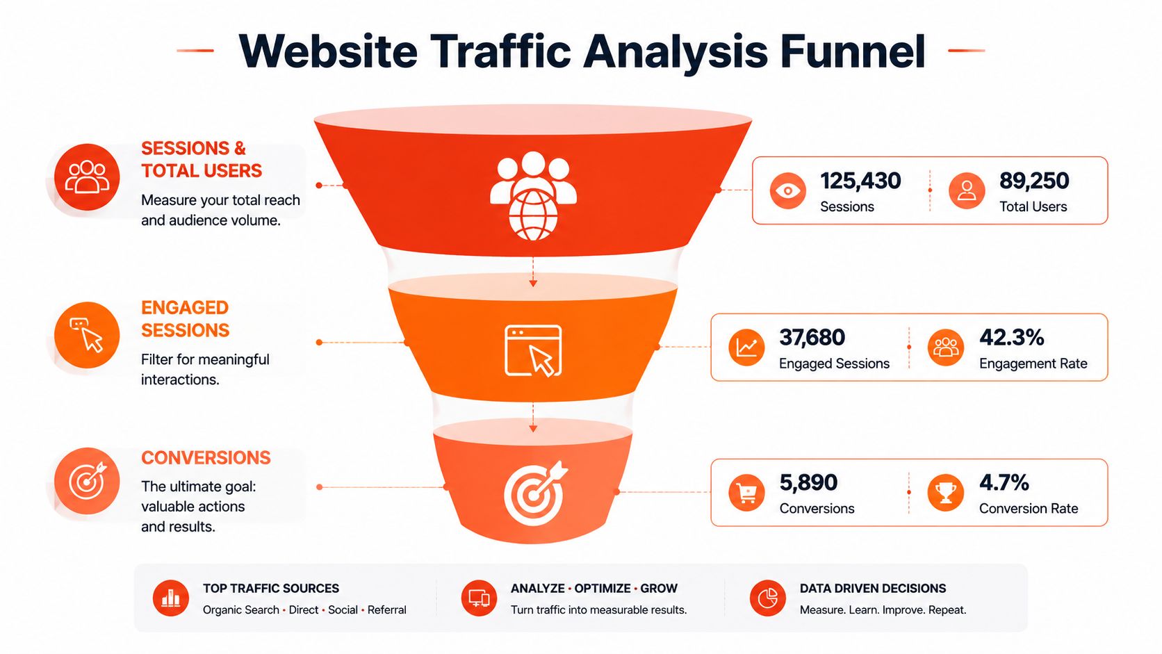
Read the funnel as a sequence. Sessions and total users show reach, engaged sessions show whether the content held attention, and conversions show whether the site produced a business result. That is the routine that turns website traffic analysis into something you can act on week after week.
Diagnosing Common Traffic and Conversion Problems
When the dashboard turns red, the right move is a short diagnostic routine, not a redesign. I’ve seen too many owners start changing headlines, colours, and layouts before they’ve checked whether the traffic drop was real, whether the events were firing, or whether the issue was limited to one device or channel. Good diagnosis is boring, but it saves budget.
Use a simple decision tree
If traffic drops suddenly, start in Google Search Console and check indexing, manual actions, and crawl problems before you blame content quality. Then look at seasonality and timing. If the dip lines up with a known quiet period, it may be a pattern rather than a failure.
If traffic is healthy but conversion is weak, move down the page path. Check page speed, mobile layout, form length, and trust signals like reviews or clear contact details. A page can attract the right visitors and still lose them at the last step if the form feels too long or the mobile layout gets in the way.
The other problem is broken measurement. Cookie consent rejection, missing events, and cross-domain breakage can make a site look underperforming even when users are converting elsewhere. That is why raw traffic reports should always be checked against the tracking setup before conclusions are drawn.
Diagnostic order: confirm tracking, verify the date range, check the right segment, compare with a known good period, then decide what hypothesis is worth testing.
Keep the checklist on one page
A good troubleshooting page should answer the same questions every time. What changed, where did it change, and is the change happening on all devices or only one. If you can’t answer those quickly, you’re not ready to make site changes yet.
| Symptom | First check | Likely next move | Owner | Review Date |
|---|---|---|---|---|
| Traffic drop | Search Console indexing | Check content, links, and seasonality | Marketing | Weekly |
| Low conversions | Mobile layout | Simplify forms and improve trust signals | Website owner | Weekly |
| Missing events | Tag Manager setup | Fix tracking and retest in DebugView | Analyst | Same day |
| Strange spikes | Source and device mix | Compare with campaign, newsletter, or bot patterns | Marketing | Same day |
| Regional mismatch | Geography report | Decide whether the traffic is useful | Owner | Monthly |
A one-page diagnostic process also keeps teams calm. If everyone knows the sequence, nobody starts redesigning the homepage because of a single noisy Tuesday.
Turning Analysis Into an Action Plan for Growth
Analysis only pays off when the insight turns into an assigned task. A dashboard can identify a problem, but a written action plan is what makes the fix happen. The best teams I’ve worked with keep a simple log of insight, priority, and next step, then review it on a schedule instead of letting it vanish into Slack.
Turn findings into tasks
A Cardiff retailer once spotted mobile bounce rate above 65% on product pages. The response wasn’t a broad “improve UX” note, it was a short list of changes, compress hero images, rewrite the H1 to match the search intent, add schema, and review the page again after 30 days. That kind of specificity matters because each task can be checked.
| Insight | Priority | Next Step | Owner | Review Date |
|---|---|---|---|---|
| Mobile product pages lose visitors quickly | High | Compress images and simplify above-the-fold content | Developer | 30 days |
| Organic traffic brings good enquiries | High | Expand related service pages and internal links | Marketing | Monthly |
| Referral traffic spikes from one source | Medium | Check whether the referring page can be reused in outreach | Owner | Next week |
| Form completion is weak | High | Shorten the form and add clearer trust signals | Website owner | 2 weeks |
| Email visits convert well | Medium | Build a stronger follow-up sequence | Marketing | Quarterly |
Review on a rhythm, not on a whim
Weekly spot checks catch immediate issues. Monthly reviews show whether the KPI direction is healthy. Quarterly audits let you step back and review SEO, content, and conversion together rather than as separate projects. That rhythm keeps analysis from becoming a one-off report that everyone forgets by Friday.
If you want a practical growth process tied to site improvements, the workflow in this website traffic guide fits well with the routine above. Keep the ideas written down, give each one an owner, and put a date on the review. That’s how traffic analysis stops being a spreadsheet and becomes part of how the business runs.
1stNet AI Ltd builds websites for UK small businesses that need launch speed, managed hosting, SSL, maintenance, and SEO-friendly structure in one place. If you want a site that’s set up to support traffic analysis from day one, visit 1stNet AI Ltd and see how a done-for-you build can fit your next website project.